The Ukrainian designer developed a font concept for the new name of the metro station “Lev Tolstoy Square”
Ukrainian font designer Bohdan Gdal has developed a variant of the font for the new name of the metro station “Lev Tolstoy Square”, which is planned to be renamed “Ukrainian Heroes Square”.
According to Bohdan Gdal, the name “Square of Ukrainian Heroes” is not good enough: it is not concise, too general and does not abbreviate well. Despite this, the designer decided to propose an option that could be used in the new inscription on the walls of the metro station.
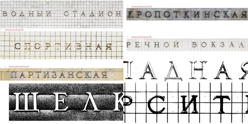
The title “Lev Tolstoy Square” uses Soviet antiques that migrated to Ukraine from Russia. It is not appropriate to use such a font in a new name.
The task is to convey the theme of Ukrainian heroics.
The main challenge was to ensure that the style of the station’s architecture, which has nothing Ukrainian in spirit, was given such a mood through the design of letters and additional graphic accents.
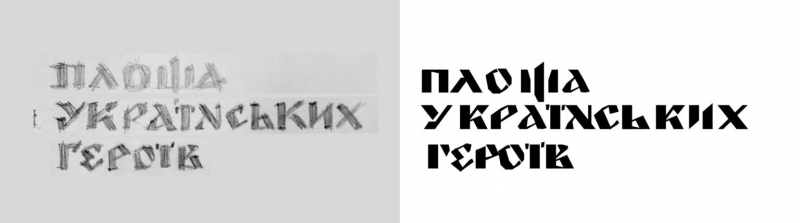
So that the letters do not feel like a foreign body, Bohdan Gdal decided to make them elegant. There were several options in the process of finding an idea. One of the options is an inscription where the letters had a high contrast, seemed rough and monolithic to convey the spirit of warriors, but the style did not “fit” in the spirit of the station.
The designer conveyed the idea of heroism with the help of the Cossack cross, which is on the emblems of the Armed Forces of Ukraine, the Ministry of Internal Affairs, the Security Service of Ukraine, and other security forces, as well as on the coats of arms of regions, cities, and villages.
“This symbol has very deep roots, is a fairly simple geometric shape, echoes the army slang “plus” as a sign of agreement. And, in addition, it enriches the font composition and creates a sanitary zone on the sides to protect the inscription from advertising, which is now often abused by the subway. The cross is also kept between the words to create a rhythm in the composition,” writes Bohdan Gdal.
The Ukrainian spirit in letters is conveyed with the help of the original historical forms of some letters, and the style of the beginning of the 20th century of the era of Narbut and Krychevsky.
The letter Ш has a central tail instead of a side tail — an emphasis on antiquity, a hint of the state coat of arms, which also echoes the emblem of the Armed Forces of Ukraine on the soldiers’ chevrons.
The letters N are a typical “Narbutian” letter.
The letter U is an ancient historical ligature form of OU.
In the letter O, the trademark stroke at the top, which goes back to Glagolitic, has been preserved.
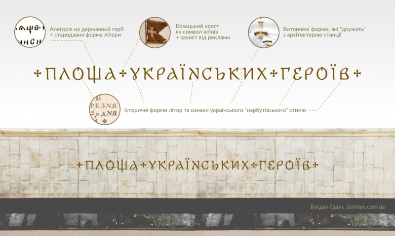
IN THIS WAY, WE HAVE BOTH “SEWED” SYMBOLS AND A STYLE THAT GOES INTO UKRAINIAN HISTORY, AND MAINTAIN COMPATIBILITY WITH THE ARCHITECTURAL STYLE OF THE STATION.
You can read more about the font in Bohdan Gdal’s detailed case study.
Photo: bohdan.com.ua