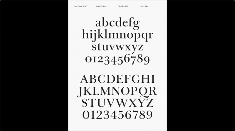
Jony Quince studio made a modern version of the legendary Baskerville typeface
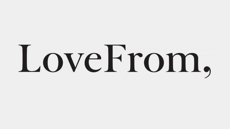
And the comma was made the key symbol in the logo.
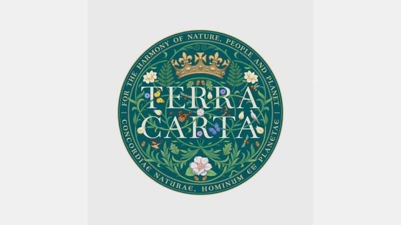
Former Apple chief designer Sir Jony Quince LoveFrom is based in San Francisco and London. It has existed for a very short time, since 2019 (the site was opened only in 2021), but has already collected an impressive portfolio: among the projects are the Terra Carta print and the coronation emblem of King Charles III, as well as work with Ferrari.
Now Ive and key employees of the company, Mike Newson and Peter Saville, have developed “LoveFrom, Serif” – a typeface that was used, among other things, when creating the logo. They worked on the agency’s signature font for several years with Chris Wilson, a former head of user interface design at Apple and a longtime university friend of Quince, engineer Patch Kessler, and Milanese typographer Antonio Cavedoni.
Peter Saville says: “Johnny asked me what it should look like…At first I thought it should be a modest font – maybe a neutral grotesque. However, the most important thing I suggested is the comma. It gives sincerity to the words and seems to initiate a dialogue. He performs such an inclusive act.”
One of the first starting points for work was the album cover designed by Saville. Section 25’s 1981 LP, Always Now, contained a typographic composition written in Bembo font. This is a cursive typeface from 1524 by the Venetian calligrapher Giovanni Taliente.
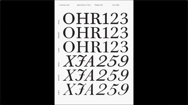
And then the designers turned their attention to another old typeface – Baskerville. It was developed by John Baskerville (1707–1775), a pioneer in many areas of typography, from papermaking to printing. The original letters of the font of the same name are now in storage at the University of Cambridge.
Designers went through many endless, barely different variations of the name John Baskerville. They worked on lighter and bolder versions of the type—styles that simply didn’t exist in the 18th century. Some letters, such as R and Q, have come up with alternative styles. The curvature of some elements was calculated mathematically.
The first official publication of “LoveFrom, Serif” took place on the agency’s website, and it first appeared in print in Steve Jobs’ recently released limited edition book, Do Something Wonderful. It was also used in the Terra Carta Seal and in the LoveFrom design for the official emblem of the coronation of King Charles III.