Behance Crescent: first half of May
We show the most “inventive” projects with Behance over the past two weeks.
Over the past two weeks, many projects have appeared on Behance that excite the imagination. In the new selection, we will use cosmetics made from industrial waste, make the barcode the main branding element, look pencils in the eye, and leaf through a magazine with the work of creative Dutch people.
Aizome Wastecare
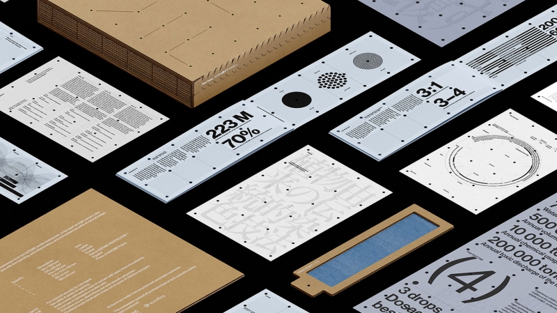
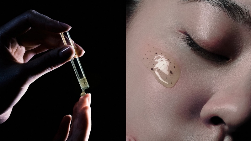
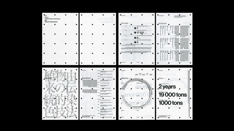
Synthetic chemicals in the textile industry harm everyone: customers, workers and the environment. Employees of the Japanese startup Aizome have developed a textile dyeing method that uses only water, medicinal plants and ultrasound. Thanks to this, not only textiles should become harmless, but even sewage.
Aizome bottled wastewater, and Serviceplan Innovation designers branded it as a premium skin care product. The bottles were then sent to opinion leaders in the textile industry for quality control.
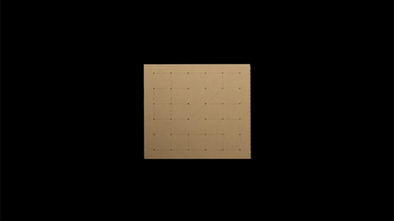
This is how Wastecare was born, a “skin care” product made from industrial waste, which aims to show that wastewater can be clean, just like textile production. The designers of Serviceplan Innovation placed the bottles in recycled cardboard boxes, and all the documentation and data on the extent of contamination in the textile industry was designed in a minimalist style.
An important design feature is small holes and thin lines. This is a reference to how water flows through pipes.
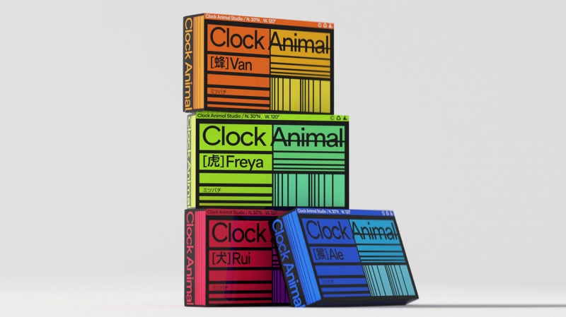
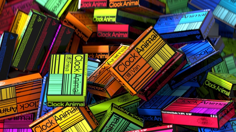
Clock Animal
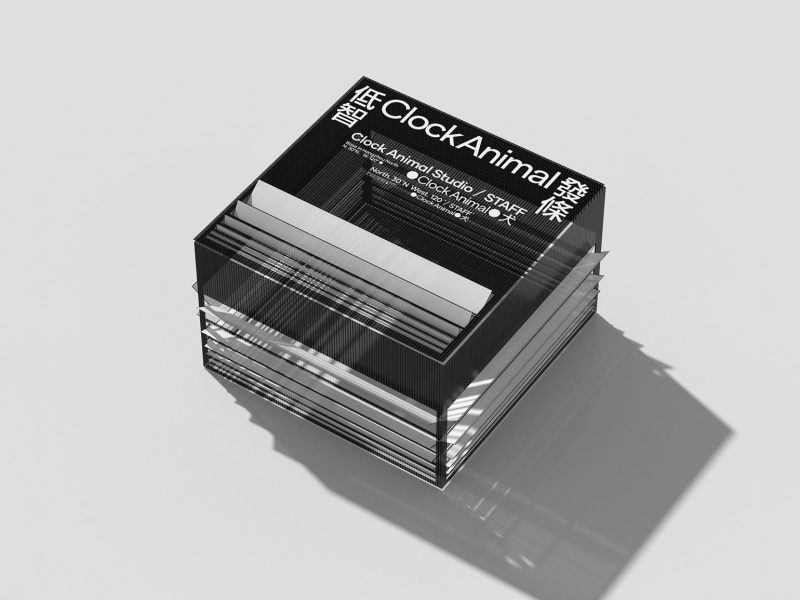
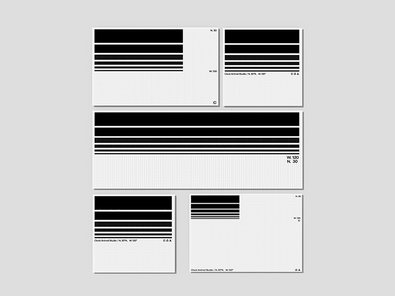
If we consider each design as a product, then barcodes are an indispensable element that everyone has stopped noticing. And the Clock Animal studio developed a package of services, which includes the creation of two brand projects based on a barcode.
Clock Animal created its corporate style based on this concept. Minimalistic business cards, business card holders and colored boxes that look like film packaging demonstrate the power of the barcode as the main element of visual style.
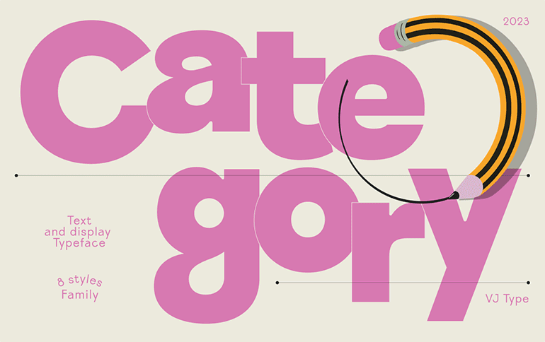
category type face
VJ-Type is an independent Parisian typography that was born out of the Violaine & Jeremy creative studio.
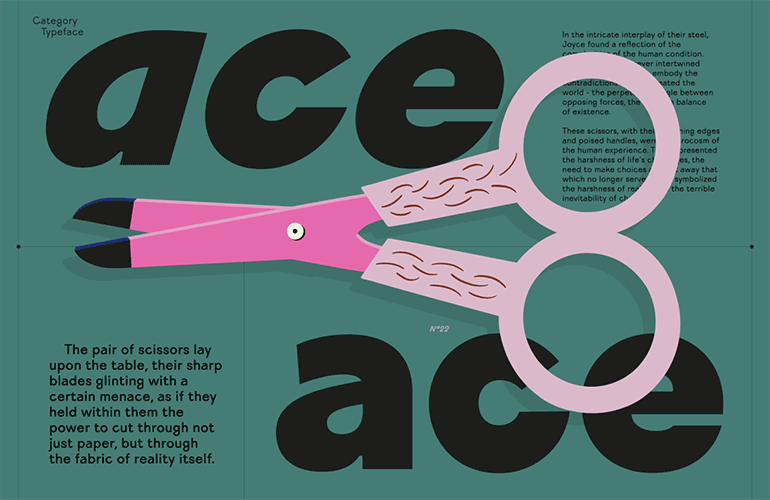
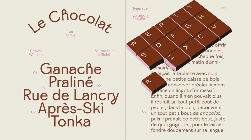
In the process of working on VJ-Type graphic design, fonts are also drawn. This is how Category was born — a versatile and friendly font with a slight touch of eccentricity. It was developed for all types of text: long, short, headings and logos.
Category has some graphical features that make it clean and elegant, but at the same time quite kinky and funny. The lowercase a, g, j, and y show this balance.
The authors added a spinning and flashing graphite pencil to the presentation of the project – a symbol of ingenuity and practicality. There are also other ironic elements here: for example, a chocolate keyboard and scissors that look like male genitalia.
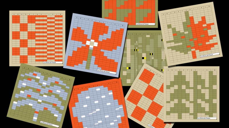
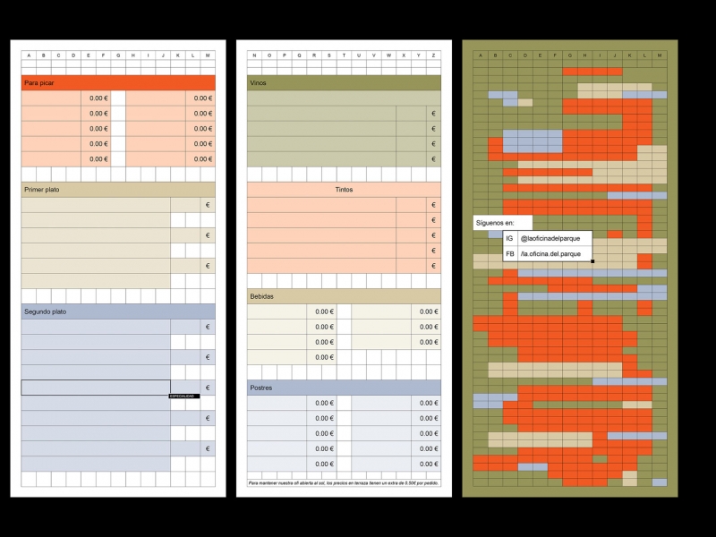
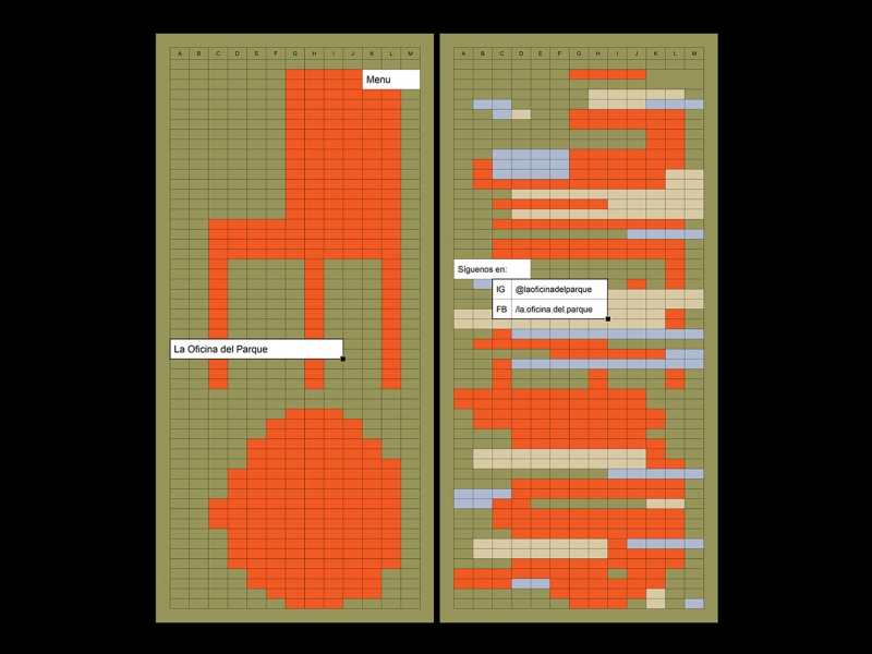
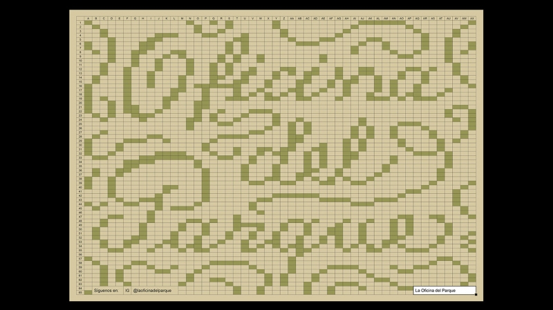
Oficina + Parque: A Modular Identity
La Oficina de Parque is a bar in the park that offers digital nomads and local freelancers a space to enjoy a cup of coffee and work in comfort.
The designers of Studio Ingrid Picanyol developed the corporate identity of the bar based on the visual language of the Microsoft Office Excel program. With the help of a grid, Excel’s typographic language based on the Arial font, we have a universal system that can be adapted to any application.
The grid has become the fundamental structure, and individual cells have become the building blocks for layouts. Groups of cells can be joined together like a constructor to bring text to the front. Alternatively, the grid can be color-blocked to align elements or highlight parts of a design.
The cells allowed the designers to create modular illustrations inspired by different elements of the park. The authors used a muted, natural color palette with orange sparkles.
Изображение: Studio Ingrid Picanyol / Behance
Изображение: Studio Ingrid Picanyol / Behance
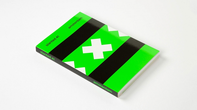
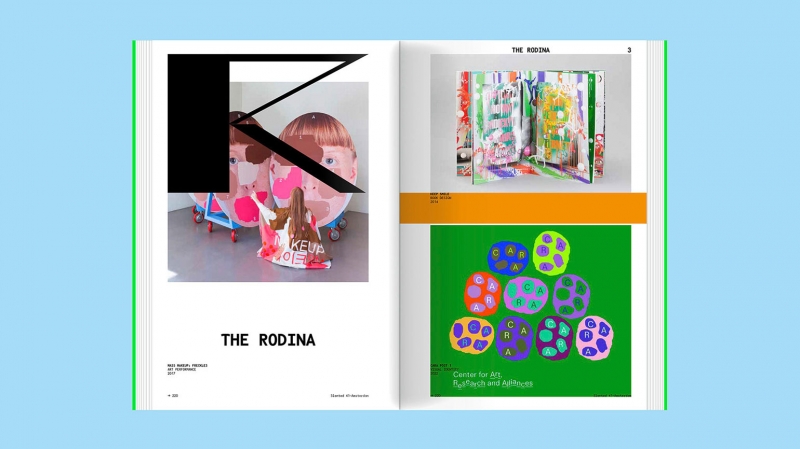
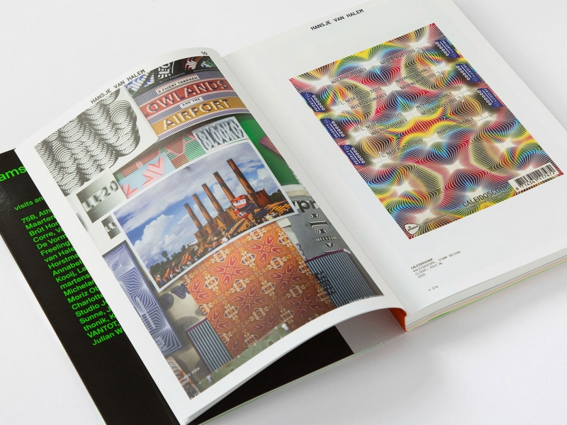
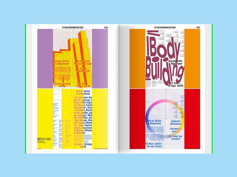
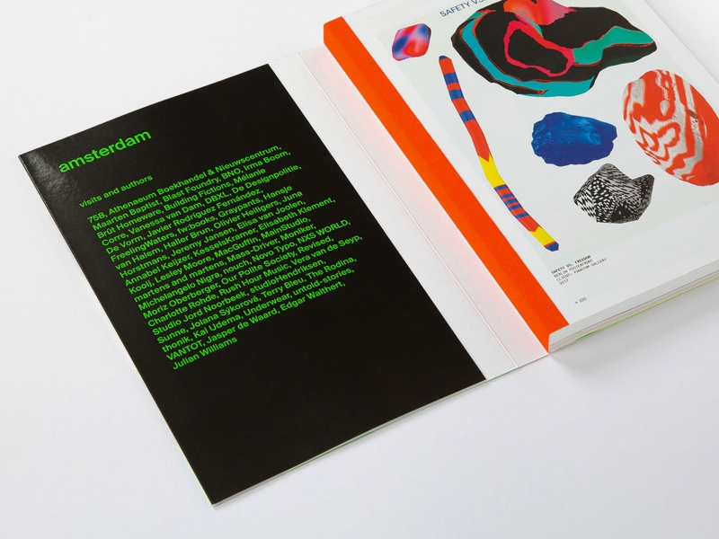
Slanted Magazine #41 – Amsterdam
The guests of the 41st issue of Slanted magazine were designers from Amsterdam. On the pages are their works, interviews, essays. The magazine also has an appendix with an overview of new Dutch fonts.
The magazine uses orange and red colors (a reference to the brick from which the houses in the city are built), as well as black, which resembles the cobblestones on the embankments of the canals.
This issue captures the essence of Dutch design – innovative, modern and functional with a touch of humor.