A Barcelona designer turns church shapes into a font
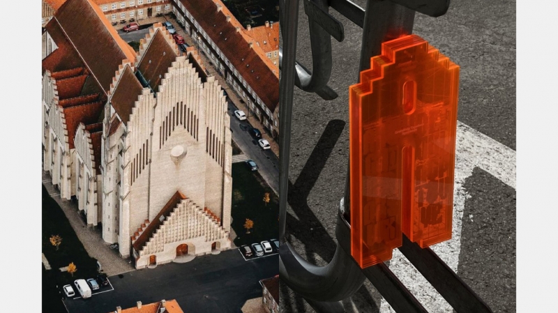
Inspired by the geometric facade and rounded arches, graphic designer Reinaldo Camej, currently studying at the Barcelona School of Design and Engineering, turned the seemingly unlikely into a digital font. He chose Grundtvig Church in Copenhagen as the basis for his typography project, one of several buildings with interesting architecture from which students could choose.
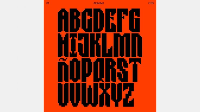
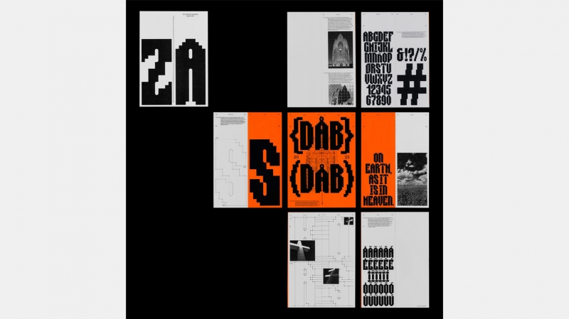
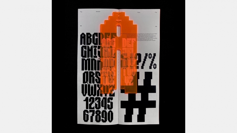
“The Grundtvig Church is an incredible building, it combines classic features and bold geometric shapes, which I admire,” says Reinaldo. “I highlighted two characteristic elements of its facade – verticality and stepped contours.” To soften the straight lines and angles, Reinaldo incorporated curves into his design. He used the shape of the door arches for letter counterforms.
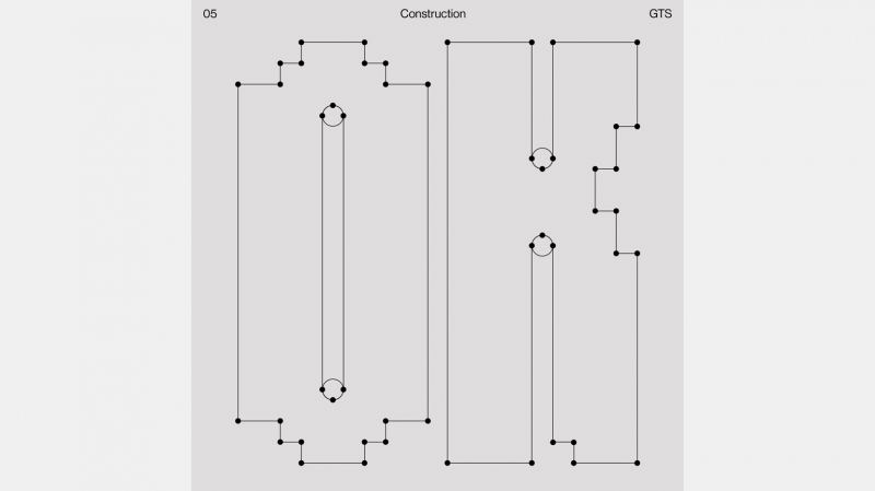
“Usually, I start working in Adobe Illustrator, and when I have drawn all the symbols, I transfer them to Glyphs to create the font and adjust the spacing,” explains Reinaldo. “But Grundtvig font is monospaced, so it’s much easier.”
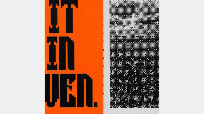
The designer did not limit himself to the two-dimensional plane. He also created a 3D image of the letter “A.” “I wanted it to imitate the shape of the facade,” says Reinaldo. It’s Nice That magazine notes that the font resembles pixelated images on a Nokia 3310.