Stamps in honor of the coronation of Charles III were made by the old method – using woodcuts
They have four themes: Coronation, Commonwealth, Diversity, and Sustainability.
Graphic design studio Atelier Works has designed four Royal Mail stamps issued to commemorate the coronation of Charles III and Camilla. British artist Andrew Davidson was invited for illustrations. Previously, he created the cover of the monarch’s book “Harmony” using woodcuts. Now he was tasked with depicting modern scenes using the traditional method.
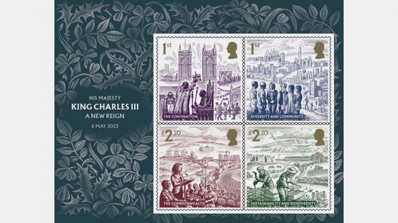
Each of the stamps is devoted to a separate topic – the obligation of the monarch or what he is interested in.
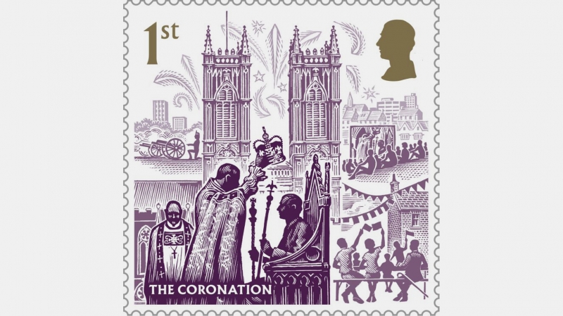
The purple stamp (purple is considered the royal color) depicts the coronation. The Archbishop of Canterbury lowers the crown on the head of Charles III, who is seated on the throne with two scepters in his hands. In the background is Westminster Abbey and fireworks.
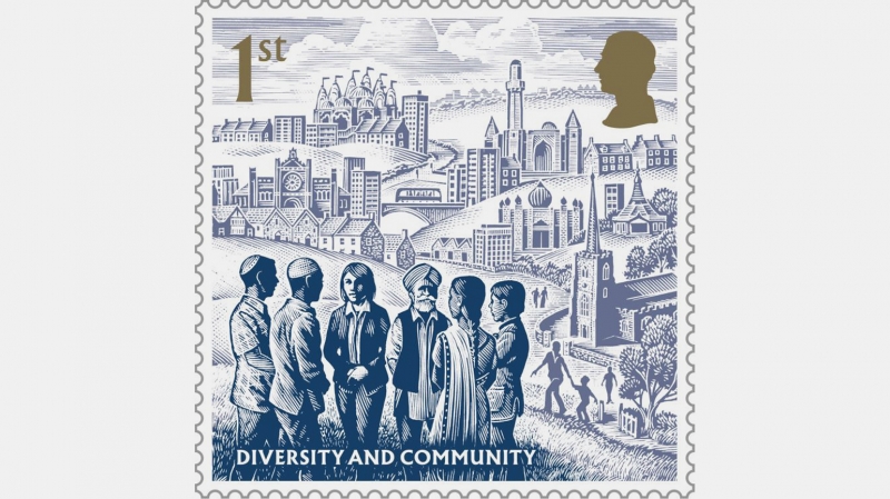
On the blue stamp is an image on the theme of diversity. Representatives of Judaism, Islam, Christianity, Sikhism, Hinduism and Buddhism are drawn. In the background are urban and rural Britain, as well as various religious buildings.
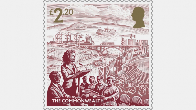
An imaginary congress of representatives of the Commonwealth of Nations is depicted in red, and in the background are the Commonwealth Games and various flags of the unification of countries.
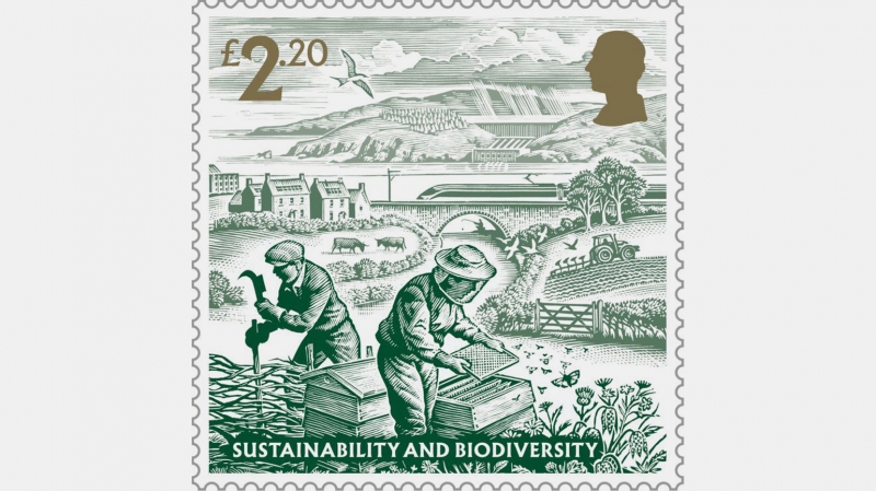
On the green stamp, Davidson created a graphic representing sustainability and biodiversity: natural landscapes, sustainable farming practices and renewable energy.
The composition of each brand resembles theatrical scenery. As you move further away, the color of the ink becomes lighter. The design and printing team worked very hard to achieve the maximum miniaturization of 8-inch originals without losing detail. Each color should be dark enough to convey small elements of the image.
For the stamps, Berthold Wolpe’s Albertus font was used because it looks like it was carved in bronze and blends seamlessly with Davidson’s woodcuts.