Font Gotham: where it is used and what it is combined with
We tell you what projects Gotham is suitable for and show examples of successful font pairings with it.
Creating eye-catching typography for a website, document, poster, or ad is not easy. The right decision is very important: fonts affect the perception of text and images, they can both attract and repel. In addition, there are many of them, and even if the main font has already been selected for the project, additional fonts will probably be needed for it.
Let’s analyze one of the popular headsets – Gotham – and tell you what to combine it with.
Gotham – what is this font
The Gotham headset came out in 2000. GQ magazine was the customer for this design project, and the task sounded like “to create a modern, rational font.”
Initially, one of its authors, Tobias Frere-Jones, was inspired by the special design of the plates in the bus terminal in Manhattan. But still, behind the design of the typeface is a large study of New York street navigation signs and everyday city lettering, which he did with his colleague, Jonathan Hofl.
The references for the design were store signs, advertisements, signs decorated with paints and neon tubes cast in metal and carved in stone. In New York, there clearly existed a special, typical pattern of letters, but it did not have a name and was not formalized into a system. Therefore, the new Gotham font, which appeared as a result of this work, began to be perceived as something natural, basic.
Moreover, it “returned” to the city that gave birth to it: since 2002, when the set entered the market, Gotham has been widely used in the design of covers, websites, advertising and signs. It was he who designed the text on the memorial at the site of the Twin Towers in New York. But Gotham’s highlight was Barack Obama’s 2008 presidential campaign, with this headset at the heart of its identity.
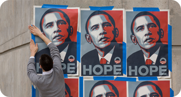
Now Gotham is considered a classic of American type design and is even listed on the MoMA Object Registry.
In the years following the release of Gotham, the Hoefle & Co studio team continued to add richness to the headset and expand its iconic lineup. Now it is already a superfamily, which includes:
- 66 Gotham family fonts – 33 weights from Thin to Ultra in weights from Extra Narrow to Regular and their corresponding italics;
- 8 fonts of the Gotham Rounded family.
Gotham supports extended Latin, Cyrillic, Greek.
The previous version of the Balenciaga logo, from 2013 to 2017, was recruited by Gotham
Image: Balenciaga
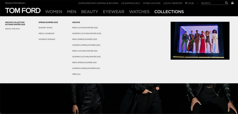
Gotham is used in the typography of the official website of Tom Ford
Screenshot: Tom Ford website / Skillbox Media
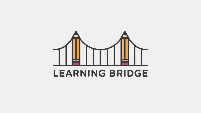
Gotham Rounded в логотипе для образовательного стартапа
Изображение: John Duggan / Dribbble

Several versions of Gotham are used to decorate both the furniture designer’s logo and the texts on the website. For decorative purposes, one i in the word Triptico was replaced with a letter with an acute accent, a diacritical mark. This glyph is also included in the font box
Screenshot: Vinicius Siega website / Skillbox Media
Gotham in the interface

Font pair Gotham and Ninna
Screenshot: Calendario Pirelli 2023 website / Skillbox Media
The theme of the 2023 Pirelli Calendar is “Love Letters to the Muses” featuring 14 models depicted as patrons of the arts and creativity. This mood in the site design is supported by the ornamental typeface Ninna, which is paired with Gotham.
The latter was chosen not just as a font that works well in web design: Gotham links two separate digital products – a calendar site and the official Pirelli site, where it is also used in the interface.
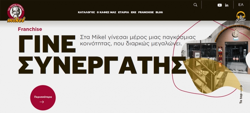
Font pair PF Highway Sans Pro and Gotham
Screenshot: Mikel / Skillbox Media website
The typography of the website of the Greek coffee shop chain is based on a combination of Gotham and PF Highway Sans Pro. The design of the second grotesque is also based on the design of American navigation – road signs, the design standard of which was adopted in 1966.
PF Highway Sans Pro came out around the same time as Gotham, in 2001, and was created by Greek designer Panos Vassiliou.
Gotham in the box
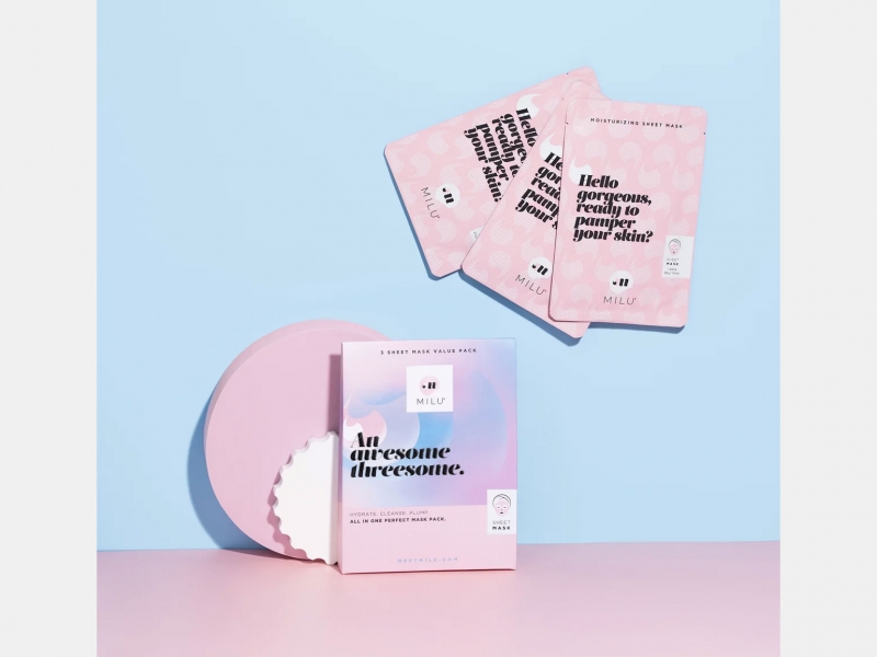
Font pair Salome Stencil and Gotham
Image: Milu
The logo of the Milu cosmetics brand is decorated with Gotham Light, and the inscriptions on the packages are a combination of Gotham Light, Gotham Book and Salome Stencil display font.
Salome gives the design a light, playful mood, which is especially noticeable in contrast with the “rational” Gotham.
Gotham in identity
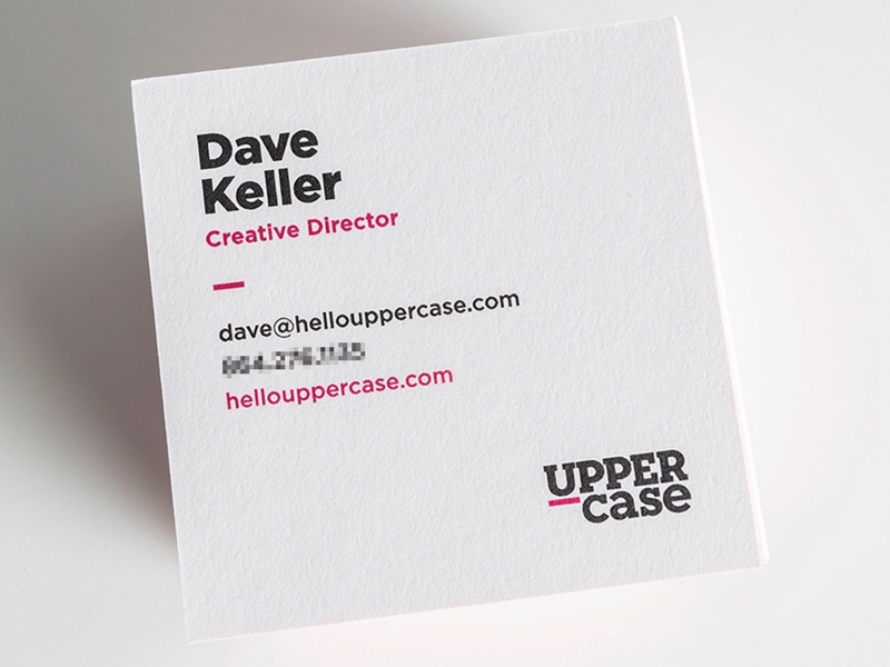
Gotham font pair and bar serif
Image: Dave Keller / Dribbble
A simple identity with an American visual character for a small design studio: Gotham for texts and a logo set in slab serif.
Gotham in visual communications
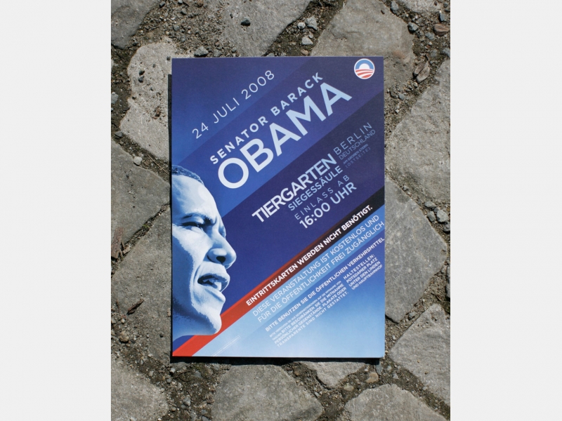
Gotham in the visual system for Barack Obama’s campaign
Photo: Charles Ommanney / Getty Images
2007 is the year when the US presidential campaign made a big bet on graphic design. The New York grotesque in the visual system was intended to express the confident and clear voice of the Illinois candidate.
Gotham in print

Chip Kidd is best known as a book designer, and from time to time he turns to Gotham in his work. For example, he designed the cover of the American edition of Haruki Murakami’s novel “1Q84” with this typeface in Black. Due to the geometric character and non-contrast strokes, the cut out letters are well readable – as if they were printed with bright ink.
Where to download and buy Gotham
All fonts of the Gotham superfamily are paid. You can buy them:
On Typography.com. This resource is owned by Hoefler & Co, who owns the rights to Gotham.
In the MyFonts directory. To access it from Russia, you need a VPN.
If you come across an offer to download any Gotham font for free, then it is most likely illegal.
You need to be careful with the Cyrillic version. Aggregator sites have a free Gotham Pro font created by unknown designers a few years ago. The pattern of the letters of this free Cyrillic alphabet is noticeably different from those made by Hoefler & Co.
