Pointed ceramic egg wins Loewe Foundation Craft Prize
The building of the Philharmonic and the letters of the musical scale resonate in the tone of the music.
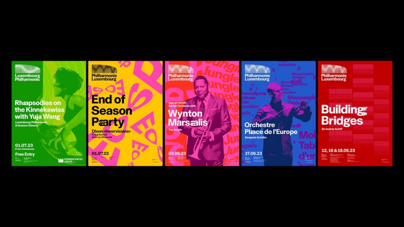
The British studio NB Studio has rebranded the Luxembourg Philharmonic. Before the designers started working on the project, passers-by knew about the building, but according to the company’s art director Sam Pittman, “they had no idea what was really going on inside.” There are several reasons for this. The Luxembourg Philharmonic Orchestra is known to classical music lovers, but there were few genzers among the visitors. In addition, in addition to concerts, the institution hosts various events, including those for children.
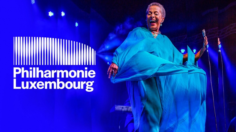
NB Studio united different activities of the Philharmonic under one brand. The logo was made dynamic — it reacts to music. A sound wave passes through the columns of the building, designed by Christian de Portzamparc. This animation was designed by creative programmer Patrick Huebner using JavaScript, WebGL and Vue.js. The wave patterns of the logo change depending on the genre in the Philharmonic app.
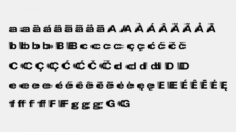
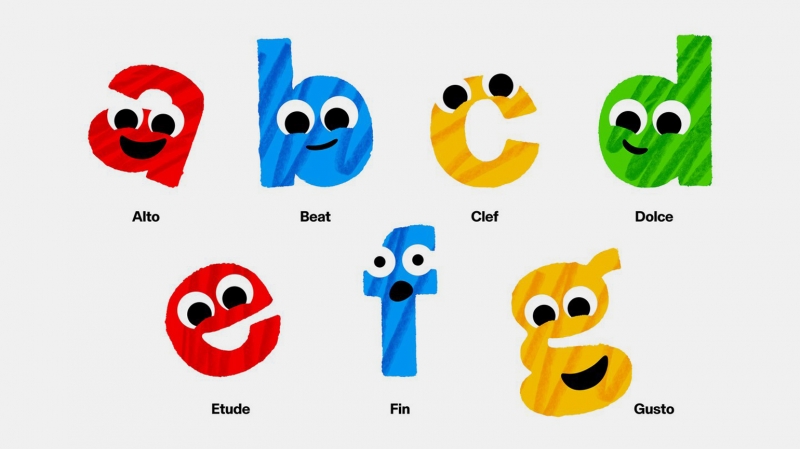
In addition, the designers have updated the typography. The letters that make up the musical scale (from a to g) also resonate on the page or screen. The letters of the scale are also played on musical instruments in an animation made especially for children.