New York-based Vineyard Theater makes its identity fluid
The project included fonts from local typographers.
Vineyard Theater is celebrating its 40th anniversary. For this event, the troupe teamed up with the London agency NB Studio to create a new identity.
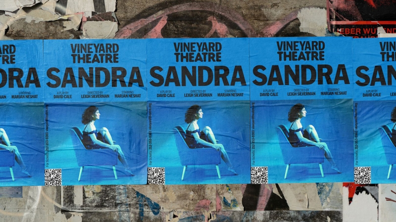
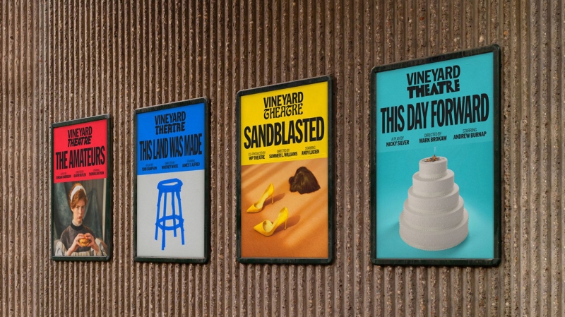
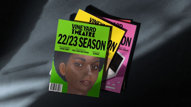
Since 1982, New York’s Vineyard Theater has been producing cutting-edge performances. To reflect the variety of productions, NB Studio created a new corporate identity, as well as several logo options at once – as a result, the logo looks different every time.
Vineyard Theater identity
Photo: Jordan Hollender
NB Design Director Ruben Algali explains that this project used typefaces from local designers: “Each typeface for the Vineyard logos was designed by a New Yorker, and its versatility allows it to work with a large number of local typographers.” Among them are the likes of Pentagram NY partner Eddie Opara, who was excited to be involved. “This simple and attractive design system allowed designers like me to express their individuality,” he says.
Vineyard Theater identity
Photo: Jordan Hollender
However, even such a changing theater needs a certain degree of consistency in order to remain recognizable, so the word Vineyard will remain unchanged, and the word “theater” will be written in a new font every time.

Vineyard Theatre’s identity
Photo: Jorden Hollander
Vineyard Theatre’s identity
Photo: Jorden Hollander
Vineyard Theater identity
Photo: Jordan Hollender
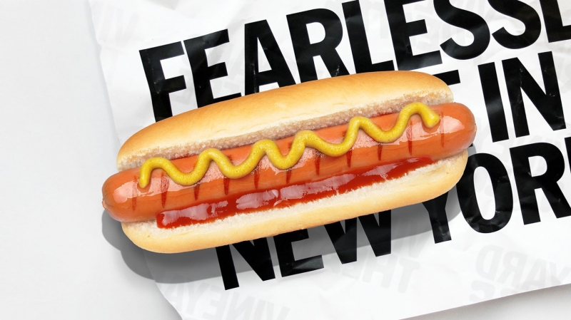
The new identity is made in a bright typographic black and white color combination. It uses a responsive font that can fit any given width. By using simple grids, the design system is flexible and adaptable to every Vineyard show. At the same time, the colors and images on the theater’s brochures and website reflect the tone and character of the individual pieces.