Coloring: what is it
And how it can be used in design. What is colorist?
In short, it is the science of color. About its nature and properties, impact on a person, as well as how to use color – in design, art and other areas related to visual design.
Color is one of the key design elements. This is what the user reads in the very first seconds, looking at the object. And coloring helps to correctly apply this tool.
It’s clear about science, let’s move on to colors: after all, there are primary colors and additional ones, right?
Yes, but the explanation cannot do without physics. The human eye, under the influence of light, can distinguish a certain spectrum of electromagnetic waves. It consists of seven primary (so-called spectral) colors: red, orange, yellow, green, blue, indigo, violet – this is how our vision perceives these waves. White, black and gray remain outside this spectrum – they are called achromatic.
In coloristics, colors are divided into primary, or primary (red, yellow, blue), secondary – those that are obtained by mixing primary (orange, green, purple), and tertiary – they are obtained by combining colors from the first two groups.
New shades can also be obtained by mixing spectral colors with achromatic ones. For example, if you add white to red, the result will be pink, and pure green combined with black will give a dark green tone.
This is kind of hard to figure out!
We understand. Itten’s color wheel will come to the rescue. In the 20th century, the Swiss artist and Bauhaus teacher Johannes Itten came up with a scheme that simplifies working with color and helps to find harmonious combinations.
Itten created a circular pattern of 12 colors. In the center of the color wheel, the base is red, yellow and blue. Above – secondary colors that are obtained by mixing them. The outer circle of the scheme includes three primary colors, three secondary and six tertiary. The shades on the diagram are arranged in such a way that you can immediately see which colors can be used to obtain them.
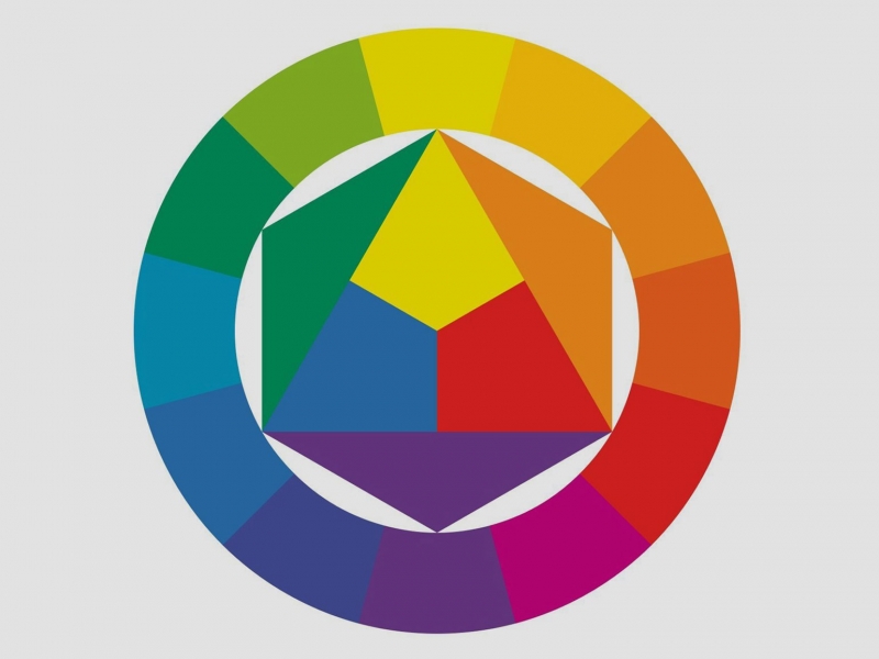
Image: Skillbox Media
With the help of Itten’s color wheel, you can select interesting combinations of colors. Read more about the possibilities of this scheme here.
Thank you, it’s become clearer. And what about saturation, brightness – do they also characterize color?
These are the key color parameters, and they are primarily related to physical indicators – the level of light, wavelength. Each color, shade has its own properties:
- Hue is an indicator by which we determine which part of the spectrum a color generally belongs to.
- Brightness, or lightness, is the degree to which a color differs from black or white. When we change the brightness settings in graphics programs, we choose a value just in the range between these two colors. It is this indicator that can turn a spectral color into an achromatic one.
- Saturation is how intense a color is relative to the brightness level.
And this knowledge is enough to work with color?
The question, of course, is a trick – no, this is not enough. The concept of color is subjective, and this is the main problem. For example, a customer may indicate in the TOR that he needs to design the site in aquamarine. Already in the process or final work, it may turn out that the designer perceives this shade closer to blue, and the client expects more green.
To avoid such inconsistencies, designers use computer color models. These are systems in which different shades and tones have their own exact parameters/coordinates. There are several models with different devices and applications. Among the most popular:
- RGB. In this color space, each color is created by mixing red (Red), green (Green) and blue (Blue) with different intensities.
- That is, each color will have its own color proportions. For example, purple in this system is denoted by the parameters 90/0/157: the first number is the content of red, the second is green, and the third is blue.
- CMYK – this system is based on mixing four colors in different proportions: turquoise (Cian), magenta (Magenta), yellow (Yellow) and black (Key color, black).
- HSB is a color model where each hue is defined by Hue, Saturation, and Brightness.
There is also the Pantone Matching System (PMS) color standardization system, in which each color is assigned a special code. Palettes are used in the textile industry, design, printing, and when they are developed, different printing methods and paint features are taken into account.
Computer color models help to understand what shade is needed. However, it is important to keep in mind the peculiarities of color reproduction on different devices and when printing: some systems are suitable for working with printing, while others, for example, are suitable for layout of websites and interfaces.
We talked about color spaces and their application in more detail here.
What other tools help you work with color?
The main difficulty when using color is to choose the right shades and harmonious combinations. Professionals have been studying color for years and training their eyesight to find the best solutions. However, there are services that can help beginners understand the color variety and save time for specialists.
For example, the Coolors generator allows you to create a palette by trying different color combinations, or find a suitable sample in a public library. And if you already have a reference in the form of an image, you can upload it to the colr.org service and create a color scheme based on it.
You can learn more about services for creating color palettes here.
When choosing color solutions, designers also take into account the psychology of color, what is it?
This is another important aspect of coloring. The point is that color can evoke certain emotions and images in a person. For example, red is associated with energy, passion, blue with water and freshness, pink with tenderness. These associations are formed under the influence of culture (in different communities, the same color can be interpreted differently) and real objects (for example, yellow seems to feel warm, because it reminds of the sun).
In design, the psychology of color can be used as a way to communicate with the user – or even as a means of manipulation. For example, in interior design, designers take into account what feelings the room should evoke: calm, set up for active work, or even provoke a feeling of hunger.
The psychology of color is of key importance in marketing: a unique color solution helps in brand positioning, expresses its values. And of course, it provides recognition. It is the color image recorded in memory that allows you to quickly find the desired product on the store shelf.