Impact of color on architecture


Just as the colors in a painting or photograph can evoke a particular mood, the colors in a building or room can significantly influence how its occupants feel. Physiologically, blue light has been proven to reduce the production of melatonin, making people more alert and awake even at night. Psychologically, people associate colors with specific emotions based on cultural symbols and personal experiences. For example, the color red may be perceived as threatening or frightening due to its association with blood.
The way a room is colored can have complex effects on its users, while the facade of a building can be perceived differently depending on its color. Below, we examine the emotional associations of various colors and how they affect architectural space.
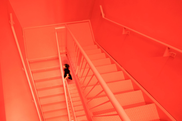
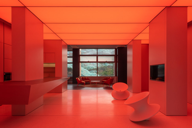
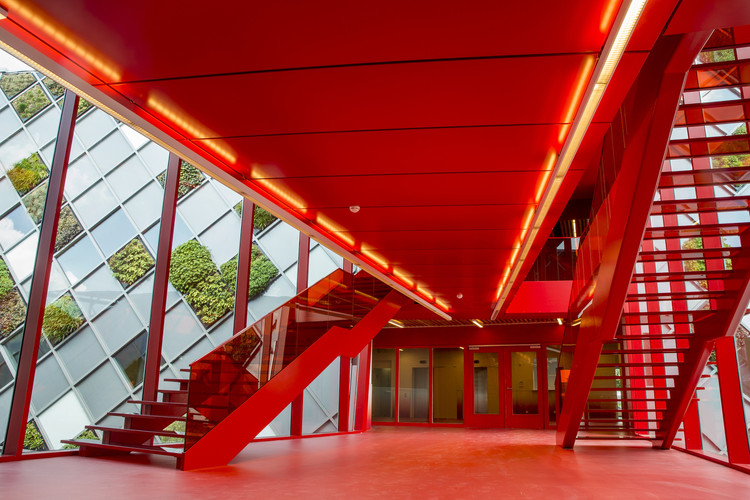
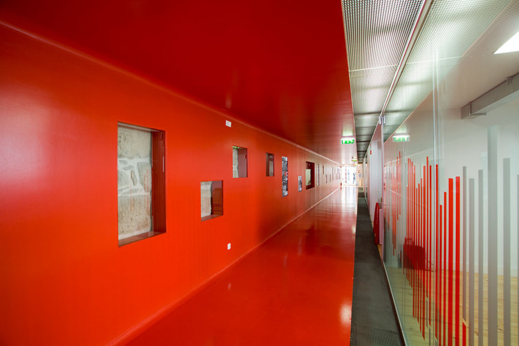
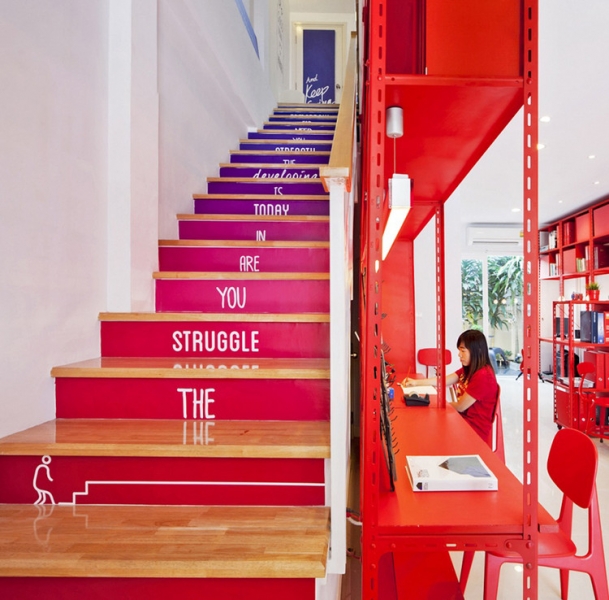
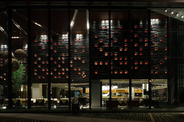
Red
Depending on its hue, red can convey passion, excitement, or warmth, but it can also be associated with fear or danger. Its perception depends on how it is used and the layout of the space. Darker, maroon shades can be alluring, while bright, neon reds are friendly and eye-catching. However, excessive use of red can feel overwhelming, so it must be used thoughtfully to create a unique ambiance. Touches of red in a neutrally colored space can also draw attention to specific objects or elements effectively.
Orange
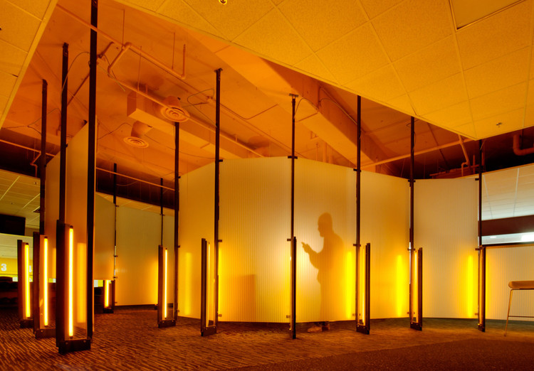
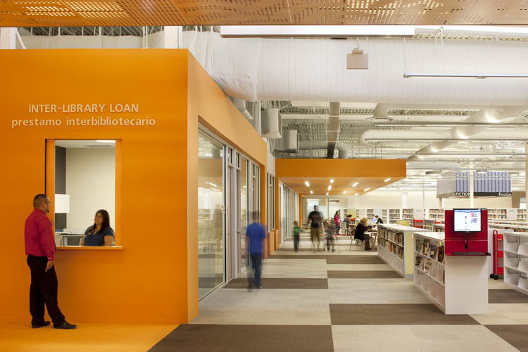
Though unusual, architectural uses of the color orange can create soothing, luminous, friendly spaces. Less ostentatious than red, orange spaces are calmer but still bright and jovial. Because it is less aggressive, it is also less risky for use in abundance.
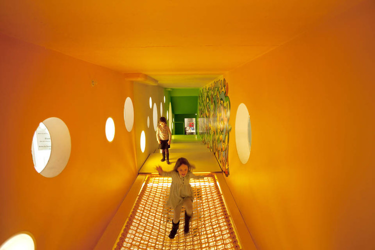
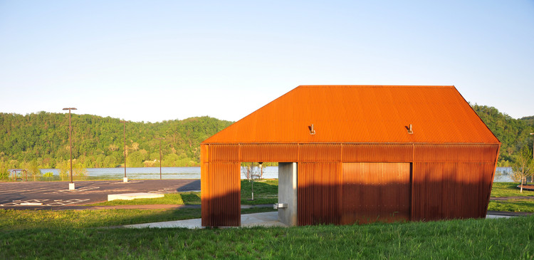
Riverview Park Visitor Service Building I / De Leon & Primmer Architecture Workshop. Image Courtesy of De Leon and Primmer Architecture Workshop
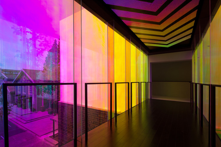
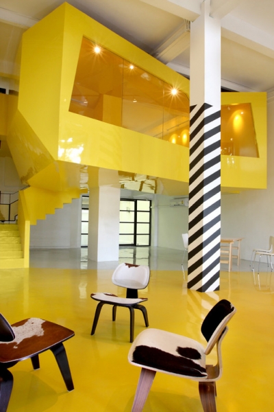
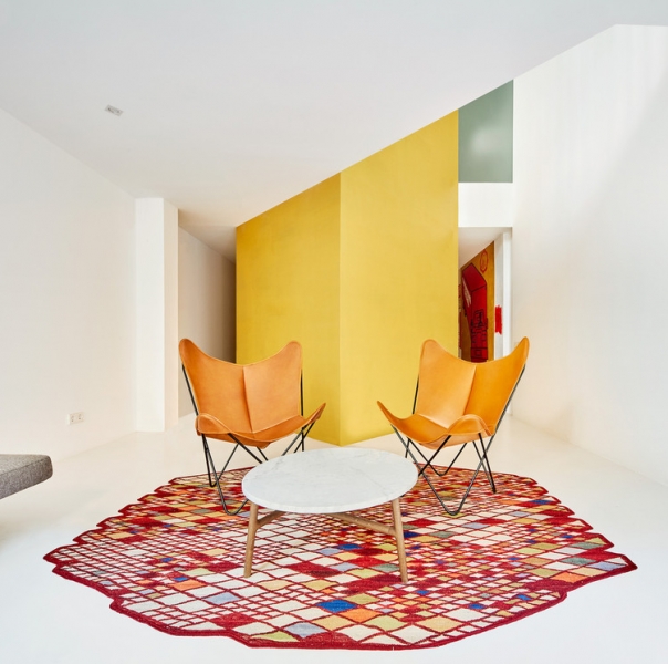
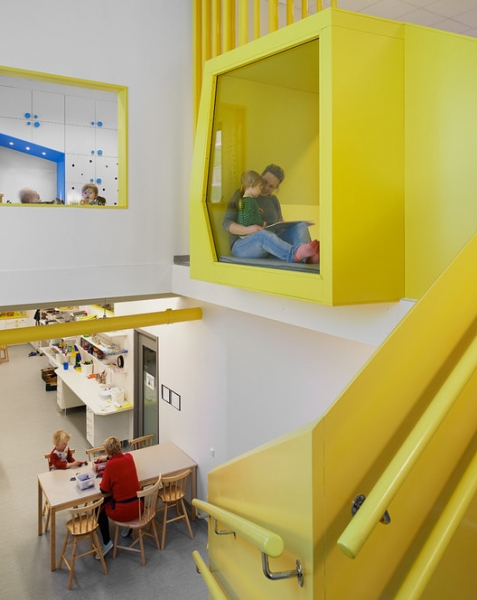
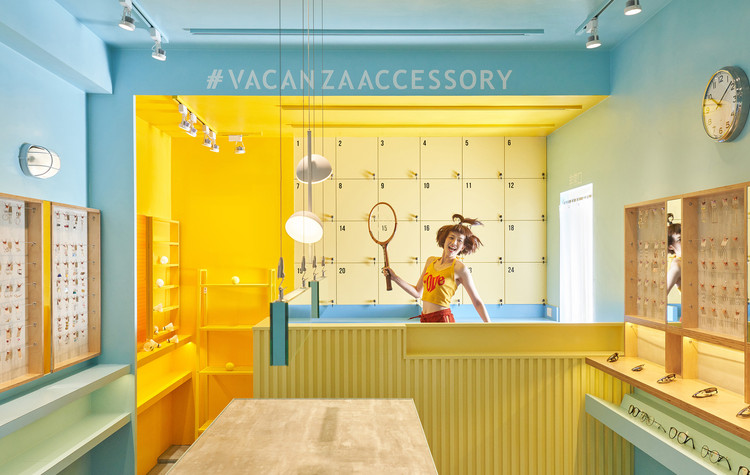
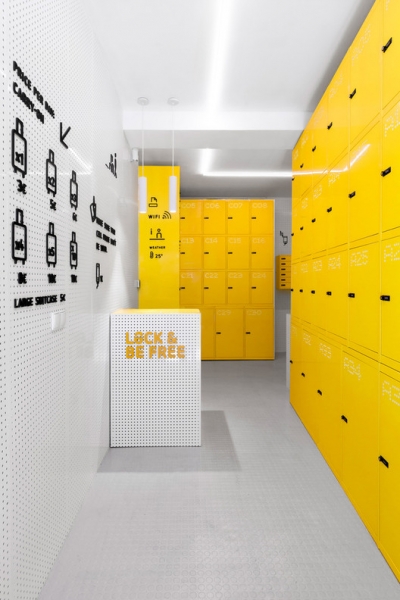
Yellow
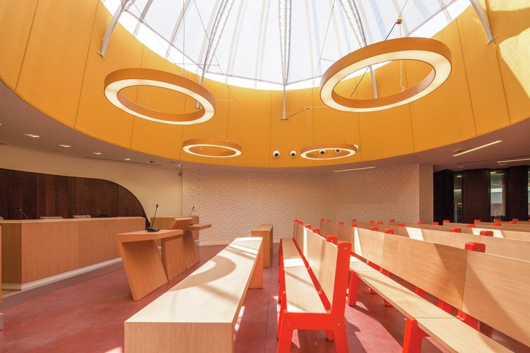
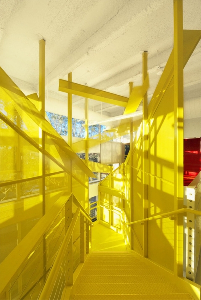
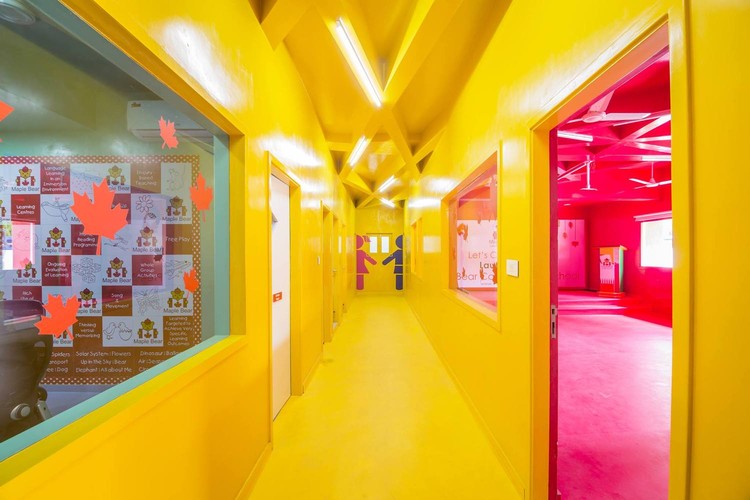
Yellow is universally associated with radiance and happiness, and can be used to highlight specific elements or throughout a space without overwhelming it like red. It is commonly used in children’s spaces, such as daycares and kindergartens, due to its friendly and playful connotations. Additionally, its brightness can make any dreary space instantly more vibrant. Pale or orange-toned yellows may have a calming effect.
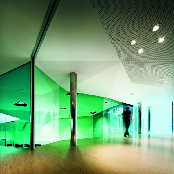
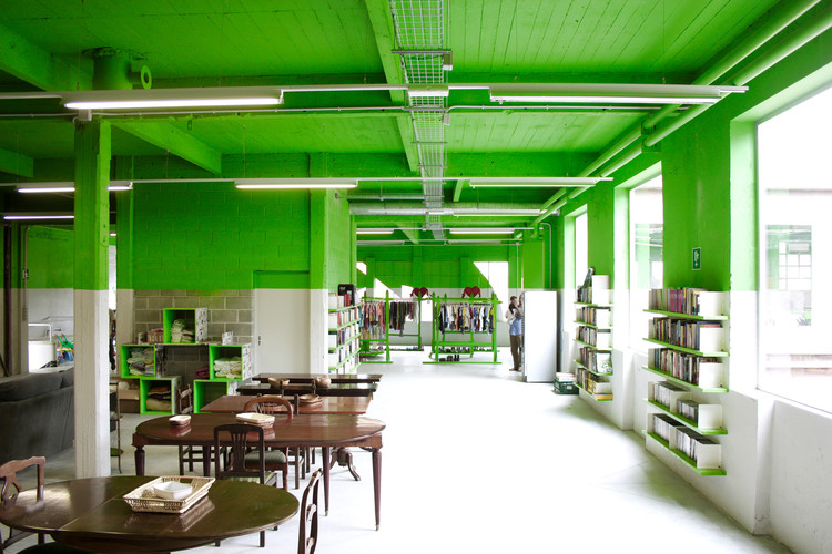
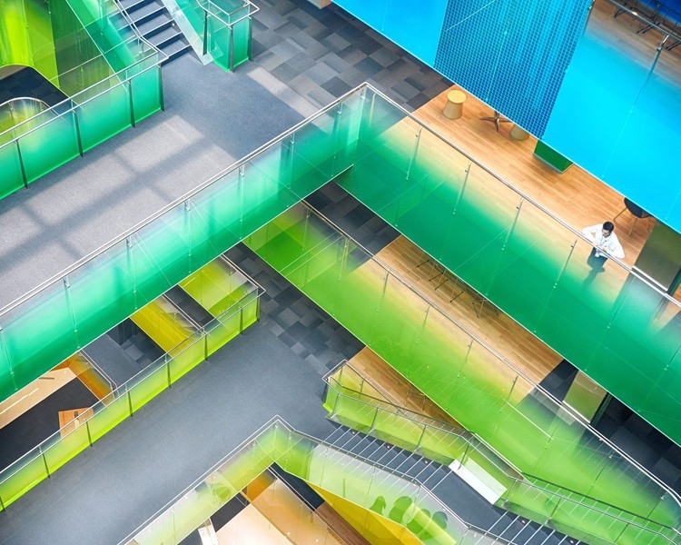
Green
Another unusual color for architecture, green – particularly emerald green or pastel green – is highly soothing and relaxing. Even neon green, however bright, generally appears calmer than other neon colors. However, yellow-green, if used poorly, may feel strangely clinical, particularly in juxtaposition with white. Externally, green walls and green roofs both suggest sustainability and connote friendly warmth.
I AM Recycled / PKMN Architectures. Image Courtesy of PKMN Architectures
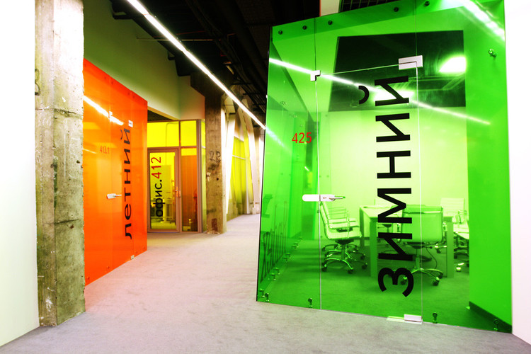
Yandex Saint Petersburg Office / za bor architects. Image © Peter Zaytsev
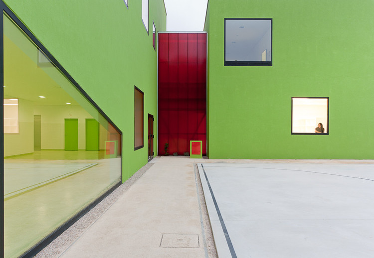
Antas Educative Center / AVA Architects. Image © Jose Campos
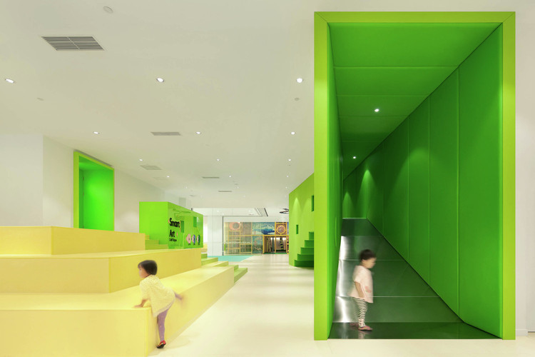
Family Box Qingdao / Crossboundaries. Image © Xia Zhi
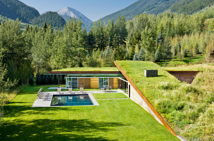
House in the Mountains / Gluck+. Image © Steve Mundinger
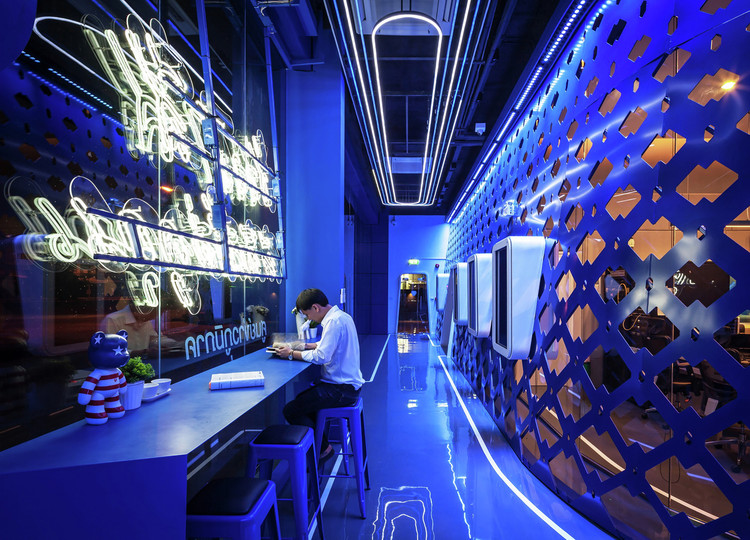
Blue
Blue is cool, soothing, dignified, and secure. On ceilings, it connotes the celestial, while individual blue elements such as columns or furniture are among the most common uses of a primary color in architecture. Blue light installations are also among the most effective in outdoor spaces.
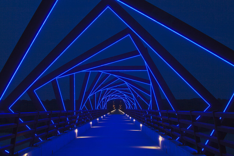
High Trestle Trail Bridge / RDG Planning & Design. Image © Iris22 Productions
Channel 7 BBTV / Apostrophy’s + Airbase Architects. Image © Ketsiree Wongwan

Melanchthon College Schiebroek / OIII Architecten. Image © Rob t’ Hart
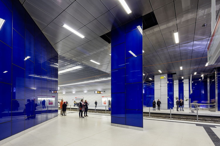
Wehrhahn-Line Düsseldorf / netzwerkarchitekten. Image © Jorg Hempel
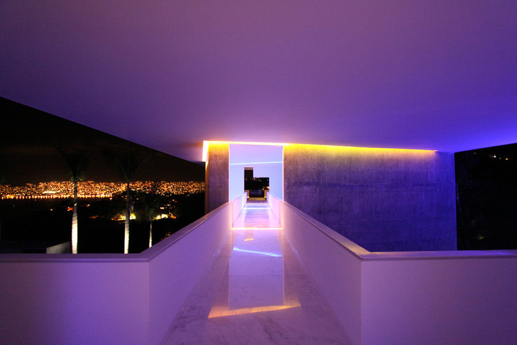
Purple
Purple, like blue, can be soft and relaxing, but to an even greater extent – particularly pastel purple in diffused light settings. Neon purple, particularly neon purple lights, are fun, bright, and exciting, and can make a lasting impression due to their uniqueness.
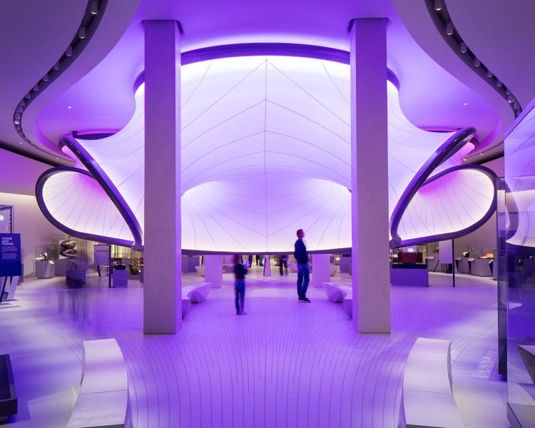
Mathematics: The Winton Gallery / Zaha Hadid Architects. Image © Luke Hayes
Hotel Encanto Acapulco / Miguel Angel Aragonés. Image © MAA
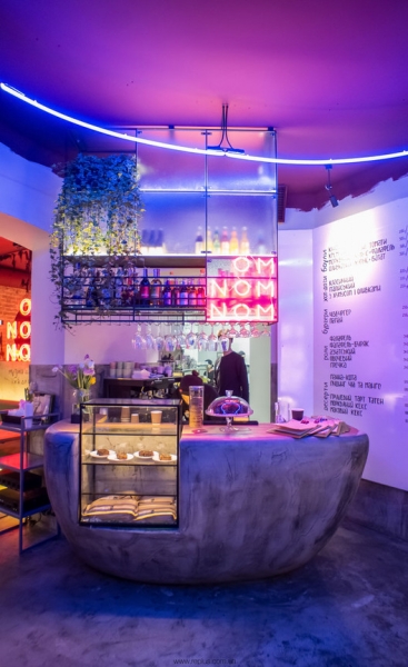
OMNOMNOM Vegan Cafe / replus design bureau. Image © Dmytro Sorokyevych
Ziggo Dome / Benthem Crouwel Architects. Image © Jannes Linders
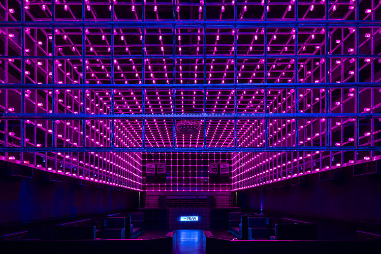
The Year / Estudio Guto Requena. Image © Fran Parente
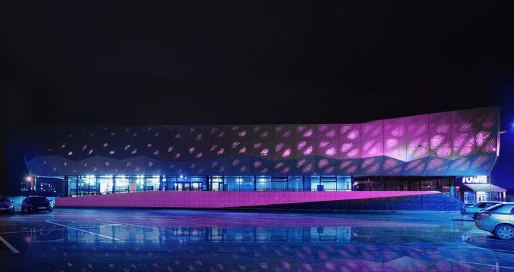
Orange Fitness Gym / KMT Project Department. Image © Ravil Safiullin
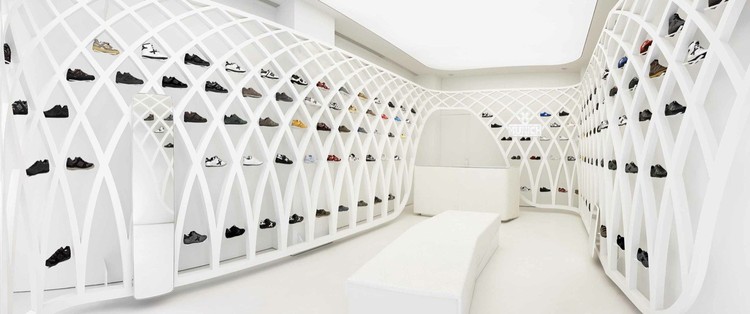
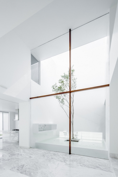
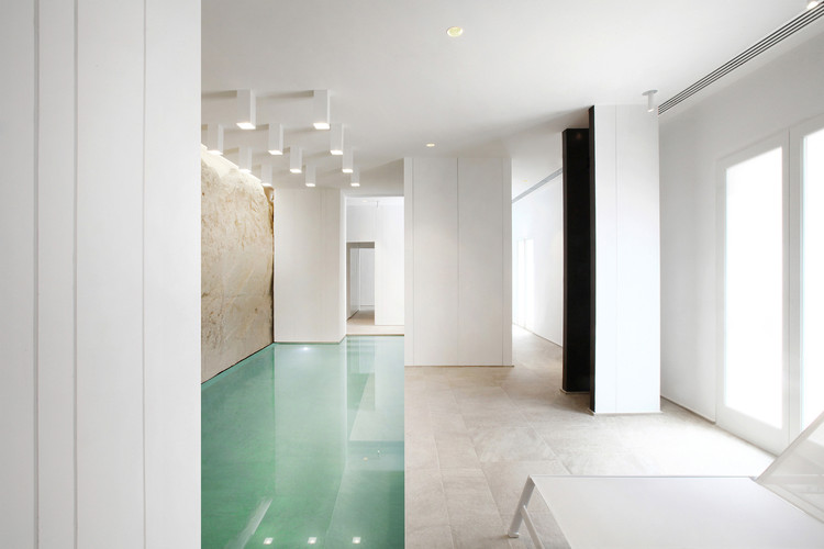
White
White walls are among the most common features of modern architecture for their connotations of purity and cleanliness. On exterior walls, they are conducive to dramatic shadows and flat, pristine facades, while interior white walls can make users feel calm but alert. White ceilings and walls also help diffuse light, making interior spaces seem brighter.
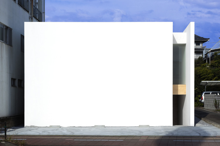
House-T / Tsukano Architect Office. Image © Kenichi Asano
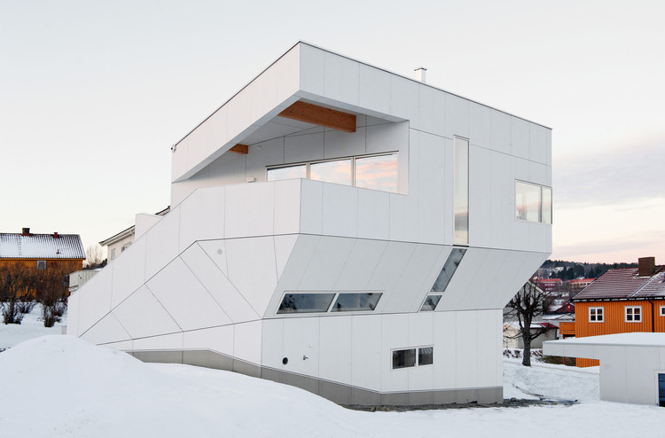
The Polite House / JVA. Image © Lars Evanger
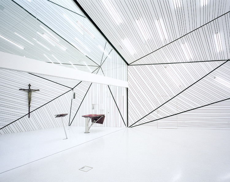
Oasis – Pastoral Care Voestalpine / x architekten. Image © David Schreyer
Munich Fractal Arena / Dear design. Image © Xavier Manosa
V House / COTAPAREDES Arquitectos. Image © Cesar Bejar
One Ocean, Thematic Pavilion EXPO 2012 / soma. Image © SOMA
White Digger / Tomas Ghisellini Architects. Image © Tomas Ghisellini
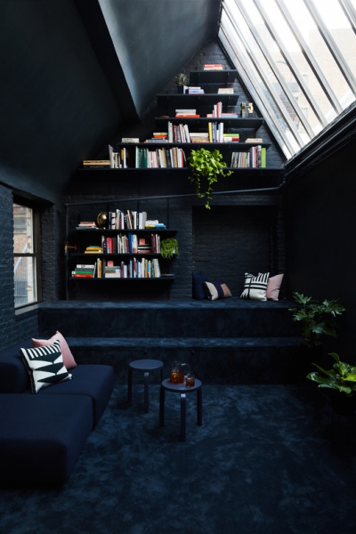
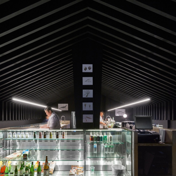
Black
Black buildings tend to appear cool and contemplative, though they may be perceived as ominous in certain situations as well. Thoughtful lighting within black interiors and on black exteriors can make rooms and facades feel less dark and oppressive. While black wooden architecture may appear rustic and introverted, black metal detailing often feels sleek and modern.
Objective Subject Offices / GRT Architects. Image © Nicole Franzen
Mr Sun Sushi Bar / Atelier Branco Arquitetura. Image © Pedro Kok
Yuwan Restaurant / Nota Design Architects + Engineers. Image © Jian Long
Evidently, color has enormous emotive power in both architectural interiors and exteriors. However, when designing with color, even something as simple or common as black and white, due consideration to lighting, material, and design is imperative as well. With each color often connoting a whole host of different emotions from the happiest to the most ominous, only cohesive and holistic design can ensure that color use generates the intended effect.
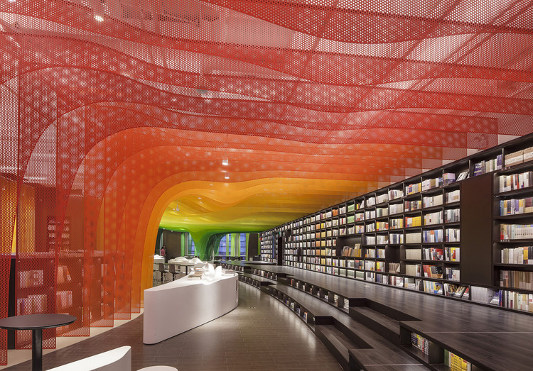
Metal Rainbow-Zhongshu Bookstore in Suzhou / Wutopia Lab. Image © Yijie Hu

Design Wing / Coordination Asia. Image © Coordination Asia
Microsoft Suzhou Technology Center / PDM International. Image Courtesy of PDM International
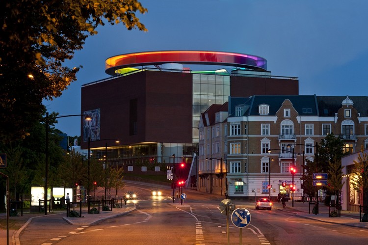
Your Rainbow Panorama / Studio Olafur Eliasson. Image © Studio Olafur Eliasson