Gray world: why design is (literally) losing color?
Reduction in the use of color has been a trend since the 1960s as British scholarship and architecture seem to follow suit.
A study carried out by the Science Museum Group, from the United Kingdom, proved: the world is increasingly gray – and more square – , especially in the last 50 years.
The survey, led by data scientist Cath Sleeman, used computer vision – a field of artificial intelligence that trains computers for visual interpretation – to explore more than 7,000 items in the museum’s collection. In the database, everyday or common objects in categories such as photographic technology, time measurement, lighting, printing, writing and household appliances, which were analyzed for their shape, color and texture.
The results: The most notable trend is an increase in gray over time, accompanied by a decline in browns and yellows. According to the study, the observed dynamic probably reflects “changes in materials, such as the replacement of wood by plastic”. There was also a reduction in the use of saturated colors from the 1960s onwards.
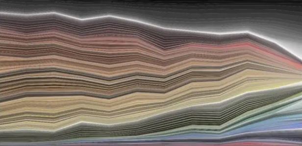
Graph representing changes in the presence of color in objects from the 1800s (left) to 2020 (right). Credit: Science Museum Group Digital Lab/Disclosure
An example highlighted by the study is the comparison between a telegraph from 1844 and an iPhone 3G. The wide range of colors in older technology is notable, especially for the mahogany used in the construction of the object, but the colors are also a result of its shape. “The rounded pillars reflect light and create shadows”, highlights the study. By comparison, the iPhone’s metal and plastic offer far less color variation, and it sports fairly basic shapes.
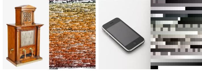
Colors present in the 1844 telegraph versus the 2008 iPhone.
Credit: Science Museum Group Digital Lab/Disclosure
One more point underlined by the research findings: when grouped by artificial intelligence using the “shape” filter, almost all objects from more recent decades are in the area that concentrates cuboidal items, from cigarette packs to televisions, from cell phones to games computer. Exceptions are the unusual desk phone, with the complexity of its spiral wire, and translucent items with more fluid lines, such as glass bottles. In short – and regardless of all the technology embedded – a smartphone looks like a box of crayons looks like a VHS tape and so on.
Bridging the gap between object design (whose analysis is based on British research) and interiors and architecture, there is a perception of a similar trend.
With more than 20 years of career, 300 signed projects and national and international awards in his luggage, architect Guilherme Torres evaluates that since the beginning of this century we have seen “a moment of ‘pasteurization’ of works’ that has nothing to do with a style.
“We see applied formulas that completely escape the concept behind their inspirations. A pastiche”, he summarizes. The interior panorama does not differ. “Only light woods and a profusion of grays and beiges. A bore, everything tastes like airplane food”, compares the architect and launches a hypothesis: “I imagine that social media and its algorithms emphasize ‘common sense’, and with that emotion is excluded”.
According to the architect and urban planner, specialist in neuroarchitecture Lorí Crízel, president of ANFA (Academy of Neuroscience for Architecture) in Brazil, the informational bombardment to which current generations are exposed has an impact on the issue, especially because it generates segmentations. One of them is precisely the search for objectivity.
“Here we can interpolate that today we are practically resuming the industrial revolution, because at that time people worked 12h, 14h a day and, today, we are back to doing that. So, people start to become more objective and this withdrawal of quantity of elements – of colors, of sensory inputs – is a facilitator”, he explains.
In a similar way to what seems to have happened with mass production items – such as our smartphones or square-shaped sofas, which are easier and more economical to produce – the rule under construction has converged more and more towards the lack of color. “The more flexible the environment is for different people to appropriate it, the better [in terms of sales and occupancy]; and one of the main factors for doing this is the exemption of identity”, emphasizes Crízel.
Looking at this broader picture, Torres agrees that bolder palettes don’t apply to real estate. “Perception in relation to colors is something very particular, and it works much better in custom-made projects. The world, in general, will continue to be gray and beige”, he laments.