How author covers helped an IT product become successful
Last year, Headway’s illustrations were recognized as the best in the Digital Art and Graphic Design category at the Novum Design Award. Headway app is the main product of the Ukrainian EdTech startup Headway, which contains 15-minute text presentations of bestsellers, as well as daily insights and gamified challenges.
Illustrations, namely a unique approach to creating covers, helped to break away from competitors and become a market leader, says Visual Design Lead Polina Gaunta. Pauline has already drawn over 1,000 illustrations for the app, developed an exceptional custom cover framework, and formed the team responsible for the production of covers at Headway.
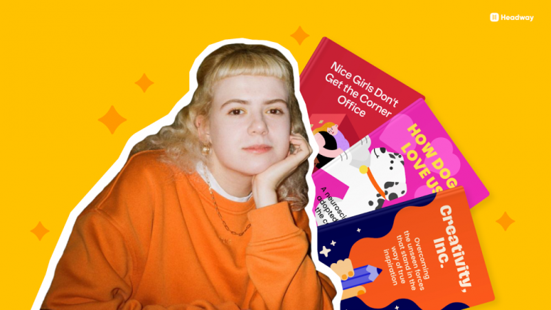
Polina Gonta is Visual Design Lead at Headway
Covers are a key element of differentiation
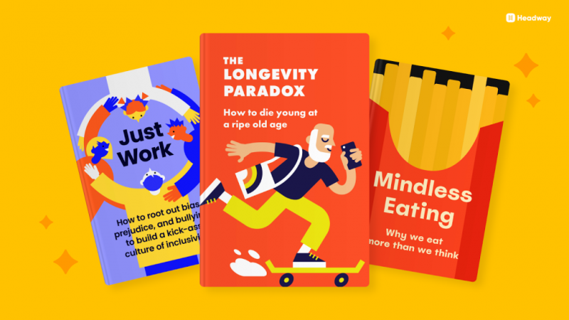
The first thing users see in our application is the book summary cover. The English idiom Don’t judge a book by its cover begins to work in reverse. After all, metaphors and clues on the covers help readers understand the main ideas of the book.
When we launched the app, we had two ways to design covers (but actually one):
Take photos, pictures and visual elements from the drains.
Create your own approach to the production of illustrations from scratch.
Of course, we chose the second option, because it is important for us to have a unique approach in creating content, covers and overall user experience. We began to adjust the process of creating illustrations: we decided on a style, developed a cover standard and began to actively multiply them.
Book summaries became more and more, and the visual component changed the appearance of the application. Bright and 100% unique covers are perfectly combined with a light and minimalistic interface. We made the first custom covers, which became our business card and helped differentiate us from our main competitors.
How to work in a product without making a guillotine out of routine
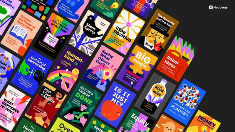
Currently, the application already has more than 1,500 covers for book summaries, as well as various collections and challenges. First of all, we actively increased the initial volume of content. 13-15 covers were published per week, and so for three months.
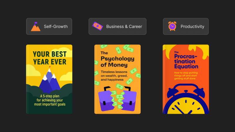
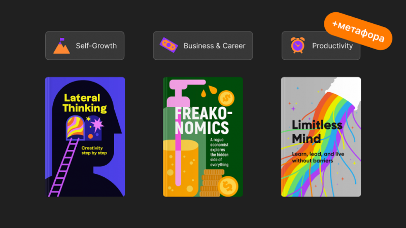
Ideas and associations appeared quickly: a leader is a cup, success is a mountain top, planning is a to-do list. Nonfiction has many categories, but the most popular are business, investment, career, productivity, self-development. According to our research, 60% of Headway app users from the US, UK and Australia say productivity is the main reason they use the app.
After 20 covers with the same themes, it became more difficult for us to find visual images, so we resorted to geometric abstractions. I also came to realize that each book has its own special feature that you can latch on to. This is how the metaphors in our illustrations appeared.
Sometimes a straightforward illustration can be effective, but more often than not, a metaphor is the best way to engage users. Familiar plots are boring, but indirect but understandable images arouse interest. Thanks to metaphors in illustrations, we can explain unfamiliar content and intrigue users. For example, UX design uses metaphors to draw attention to new features. Readers like a design that leaves room for imagination.
In the process of work, we formed an algorithm for creating a cover:
- We study the text and determine the topic of the book.
- There are often catchphrases in the headlines. It is important to understand what they mean. You can already push away from this.
- We take into account the mood. The tone of voice of the main ideas of the book helps to understand the mood, determine the color palette and images.
- We analyze the reviews of readers on Amazon. They help to look at the book from a different angle.
- We find metaphors based on current cultural trends to depict the key ideas and theme of the book.
- We use visual hierarchy to place accents and harmoniously combine the illustration with the text.
- We choose appropriate fonts and colors.
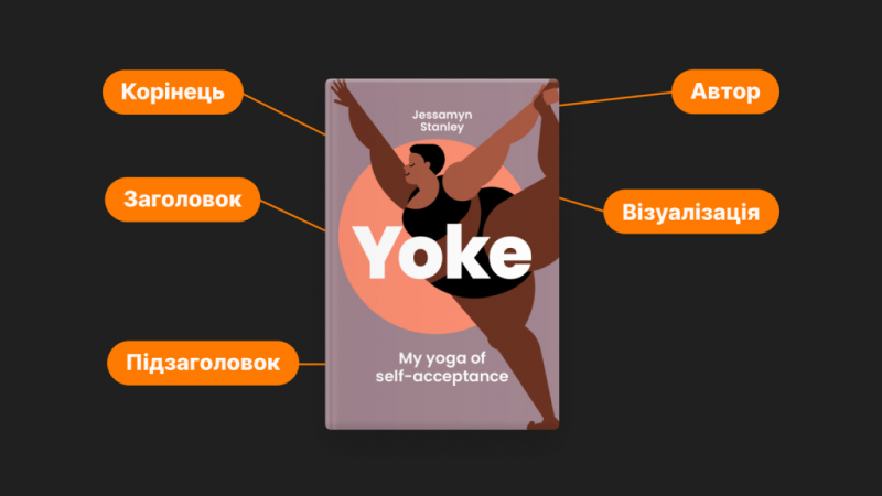
- Make the title visible.
Do not forget the subtitle and the root. They create a visual impression of a real book.
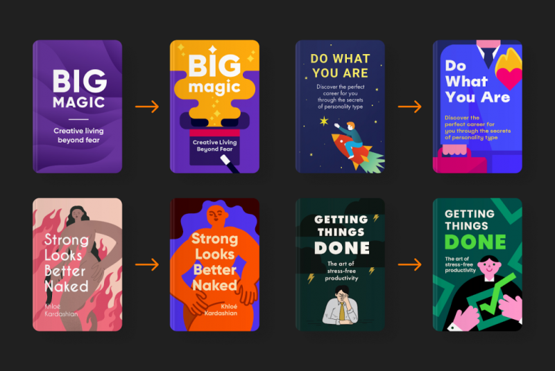
So that the user can quickly and easily understand the essence of the cover – the background, illustrations and fonts should not conflict. Over three years of various attempts and transformations, we have built a single style:
- graphic elements with moderate detail;
- use of shape (abstract or figurative);
- a small set of fonts (up to 15);
- a well-chosen palette with contrasting colors that are harmoniously combined.
It was important for us to reduce the time of creating an illustration to an adequate minimum and to easily use the elements in other illustrations. We already have over 1,500 covers, so it makes sense to use certain elements in other artwork. After the appearance of a uniform style, we set about updating the old covers to achieve consistency in the visual component of the application. This approach became an important addition to the new style.
Sensitive topics and updates due to full scale war
Our users come from different cultural backgrounds, ethnicities and gender identities. It is important to take into account the peculiarities of everyone, that is why we cultivate diversity in illustrations. Our team monitors the news and trends in the priority markets for the application – USA, Great Britain, Australia, Canada, Latin America and Spain – to understand local features and take care of comfortable perception of content.
We recently launched the Sex Education line. This is a sensitive topic, particularly for people with different religious beliefs. That is why we are more careful with the selection of visual images and test the illustrations.
At the beginning of March, we released a collection — War in Ukraine: What’s Happening, and Why It Matters — about Russian terrorism against Ukraine. The purpose of the collection is to tell as many people as possible in the world about the crimes of the Russian Federation, to explain why it is necessary to close the sky over Ukraine and to call for financial assistance to our country. In the covers, we focused on colors and meanings, which are important to convey to our 15 million users from over 140 countries.

What’s next
Headway has an ambitious goal – to become a leader in the field of educational bite-sized (concise) content. We are increasingly focusing on research, data-driven approach, developing R&D. The Headway team works to transform complex thoughts into simple and concise images, and deep ideas into modern and engaging visual content.