Designers have proven that the rules of color combinations can be broken
Color theory is a fundamental part of graphic design: the Itten circle is taught in first-year design schools, as are “correct” color schemes. But the creators of this book prove that there are no wrong combinations – it’s all about subtle combinations and design intuition.
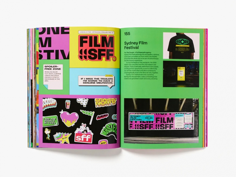
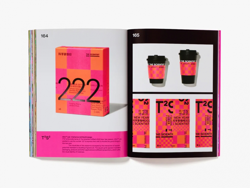
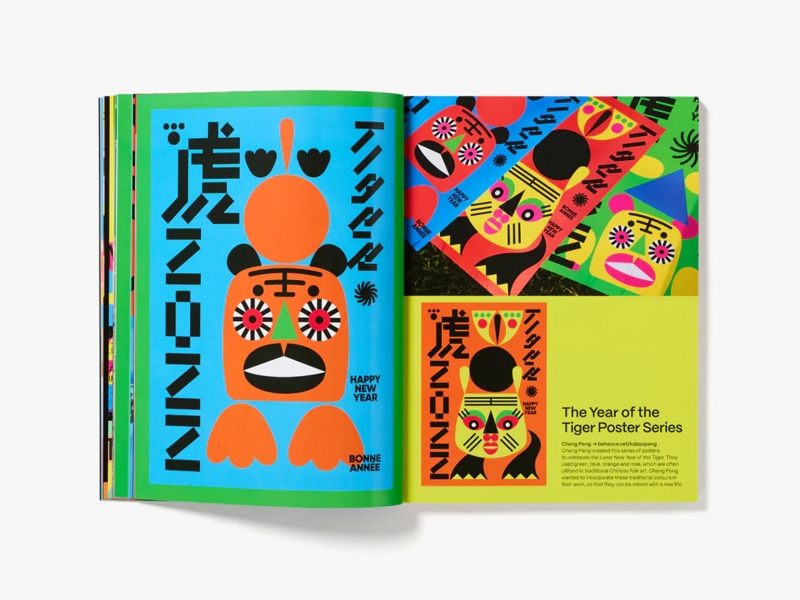
Publisher Counterprint called the book Color Clash (“Color Clash”). Editor John Dowling found color palettes that “surprise, attract, challenge and grab our attention”. Theoretically, these colors do not match, but we cannot, looking at them, say that they do not complement each other. These palettes are a reminder that color choices can be fun and bold.
John uses examples from dozens of creatives and studios – Andrej and Andrej, B&W Graphic Lab, Leon Romero, Play on Play and Studio Yukiko. These examples, accompanied by essays and interviews, explain different points – not only why these combinations break the rules, but also why they work well together.
The book is illustrated with photographs by Tom Atkinson: clothes and posters, billboards and stickers appeared in his lens. The pages highlight the color combinations.
John Dowling says, “This book showcases projects without safe, traditional color schemes and everyday palettes. We hope it inspires anyone who wants to create exciting, bold looks with color.” “Color Clash shows that designers understand everything about color harmony, but prefer to break the rules, and this leads to fresh and fun results.”