We show dynamic projects from Behance for the last two weeks
Studios often add GIFs and videos to their projects on Behance to make their work look more interesting. Every month there are more and more such projects, but over the past two weeks there has been a real boom. In the new selection, we have selected the most memorable projects with dynamic images.
JDE
In 2012, industrial designer Jorge Diego Etienne founded the JDE studio in northern Mexico. Last year, in honor of the anniversary, he turned to Director Studio to celebrate the round date – with the help of new branding.
The designers at Director Studio started with typography for the acronym JDE. They created a block alphabet in which the rounded shapes of the letters on the outside contrast with the square base on the inside. The font is individual and at the same time practical – it is easy to reproduce on any surface and maintain a clear outline.
The authors of the project settled on one color – red, which goes well with a white background and is clearly visible on cardboard boxes. A single color palette saves on production costs, while red is bright enough to make the product stand out.
JDE is engaged not only in design, but also in consulting, research, the company has its own production. Director Studio decided to pay attention to this: they made a GIF that gives an idea of the brand’s high-speed work.

Image: Director Studio / Behance
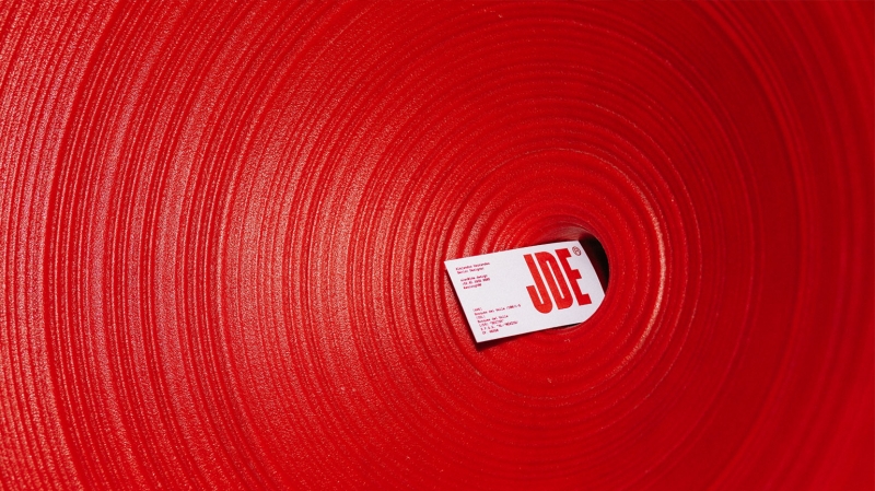
Image: Director Studio / Behance
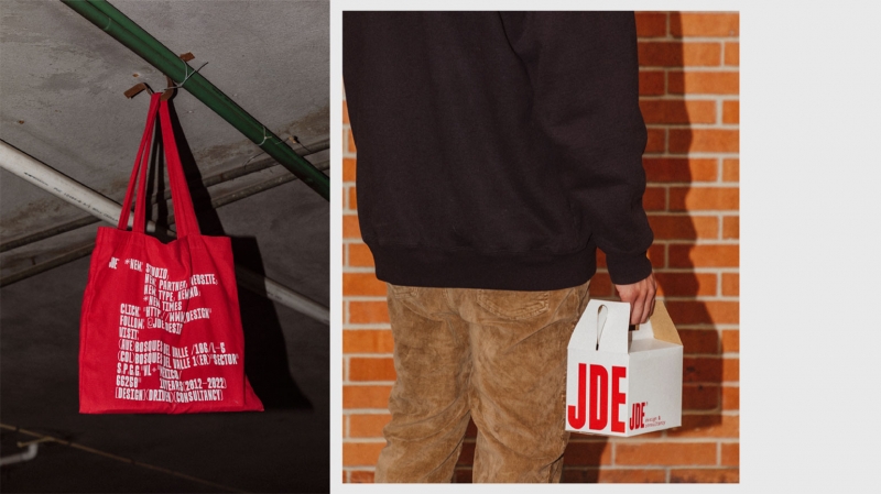
Image: Director Studio / Behance
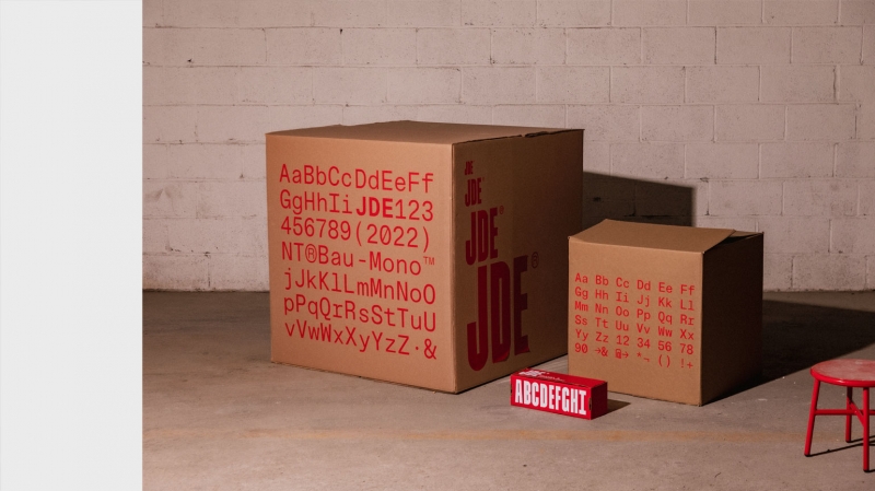
Image: Director Studio / Behance
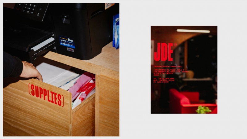
Image: Director Studio / Behance
N.U.
NU is a production company that works at the intersection of art and social projects. NU create television, feature films, documentaries, experimental films.
Blok Design created a bold branding for the company to honor the company’s pioneering spirit and commitment to creative independence.
The logo from four separate blocks turns into two letters that easily change size – this is both an elegant trick and at the same time a reference to the name of the studio. A variant of the logo with even and different-sized letters is also found on business cards and banners.
The shades of pink look the most interesting in the design. Blok Design uses this provocative color to create a space where everything looks a little weird, but wildly beautiful and juicy.

Image: Director Studio / Behance
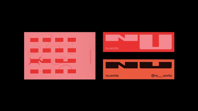
Image: Director Studio / Behance

Image: Director Studio / Behance
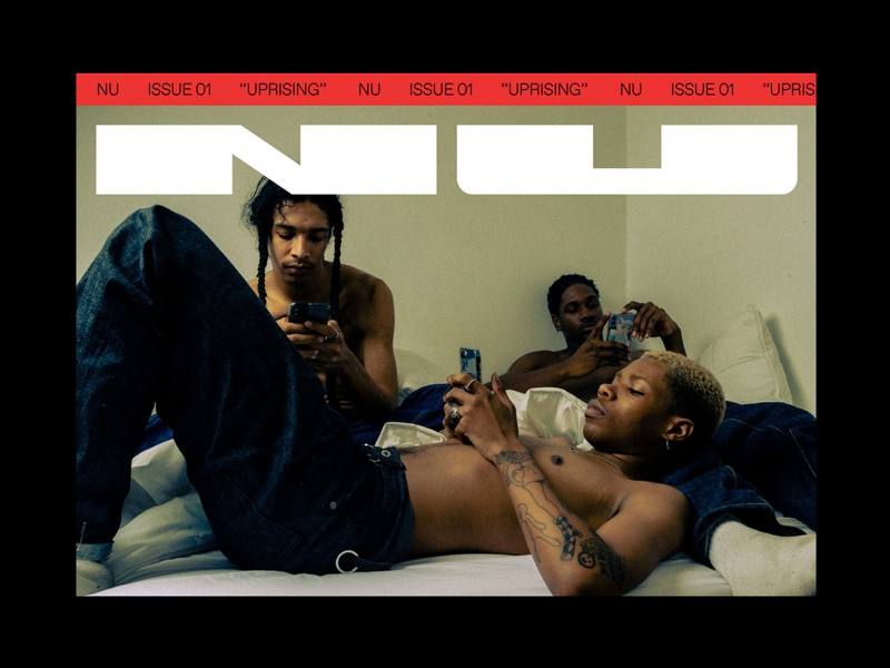
Image: Director Studio / Behance

Image: Director Studio / Behance
Susana Bettencourt
Susana Betancourt is a Portuguese fashion designer who produces knitwear from yarn to ready-to-wear and explores the synergy of digital technology with traditional craftsmanship. Her brand is best known for powerful, exclusive prints, as well as handmade plus size clothing. At the same time, the Susana Bettencourt brand strives for slow fashion and builds a business in accordance with sustainable development practices.
While working with the brand, 327 creative studio designers were inspired by the characteristic patterns of Susana Bettencourt knitwear – they decided to combine them with minimalistic typography. The black and white palette was chosen on purpose so that the main “characters” were the things themselves and their ornament. Only sometimes, as a counterpoint, the yellow color breaks through, creating a light rebellious mood.
The logo is stylized as a serpentine hook or embroidery, it is organically woven into the overall typography.
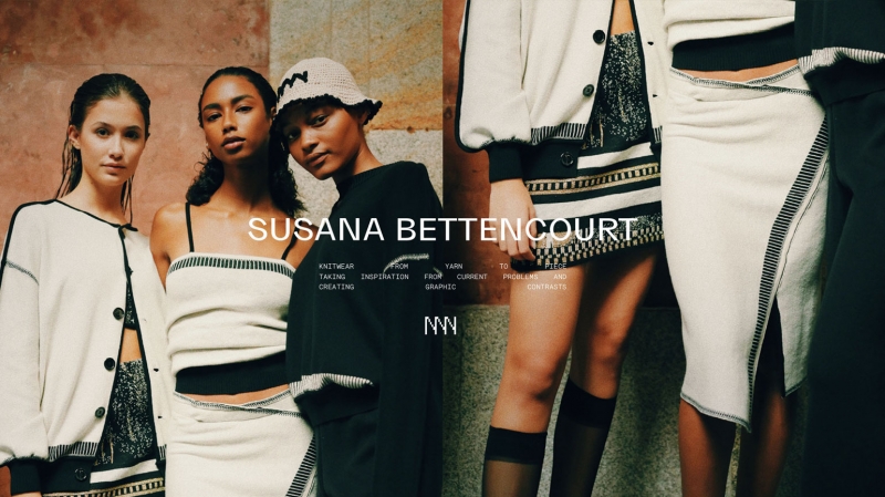
Image: 327 creative studio / Behance
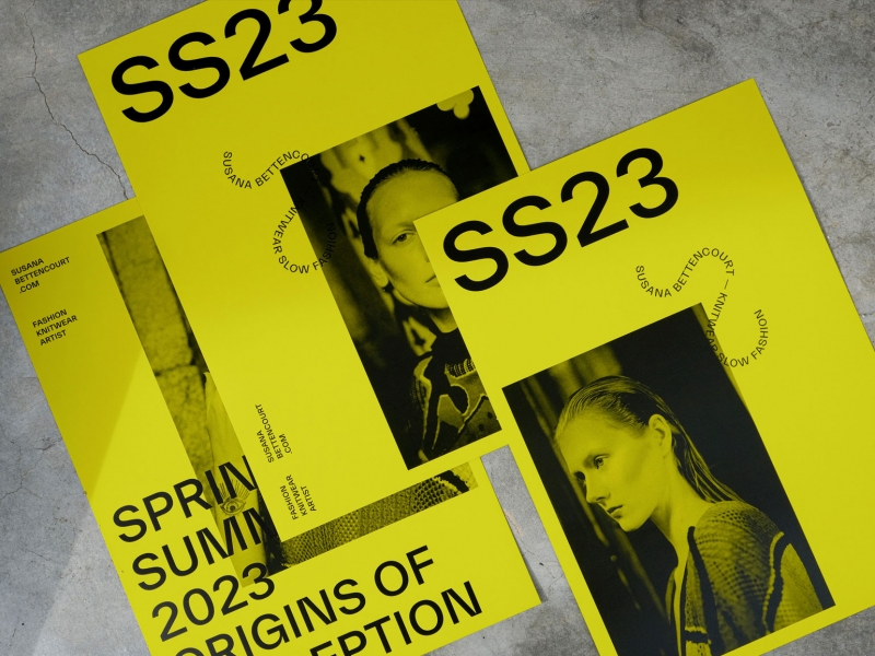
Image: 327 creative studio / Behance
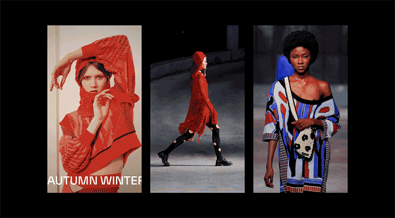
Image: 327 creative studio / Behance
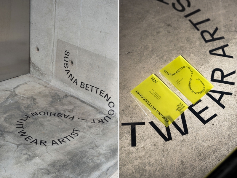
Image: 327 creative studio / Behance
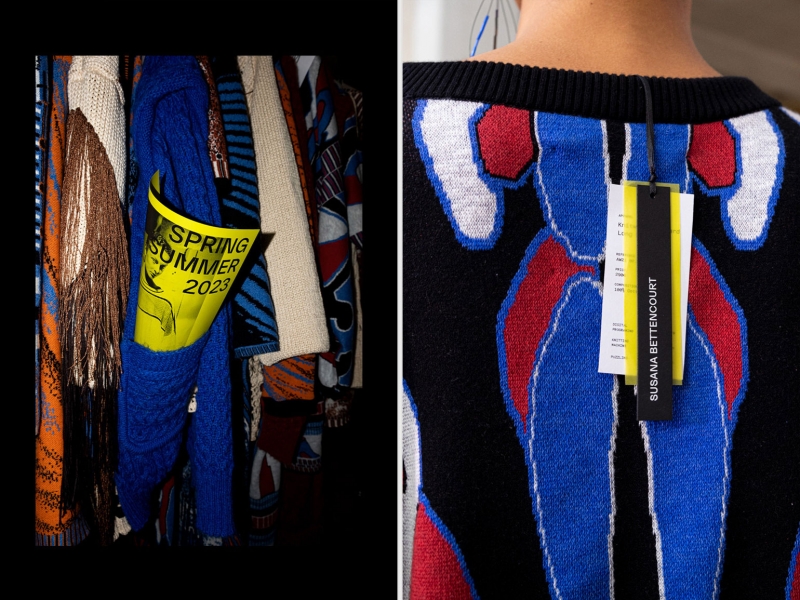
Image: 327 creative studio / Behance
Arcade
Moment Factory is a multimedia entertainment studio that designs and produces immersive works that combine video, lighting, sound and special effects. Arcade is a company project that combines motion capture technology and video game mechanics.
When working on the visual style of the project, Caserne Studio was based on the basic design of Moment Factory. With the help of typography, they simultaneously achieved both similarity with the flagship style and a strong difference. Moment Factory uses a minimalistic grotesque with straight lines and obtuse angles, while for Arcade, the designers chose a similar base, but the lines were made smooth and rounded, and the corners were sharp as the nose of a space rocket.
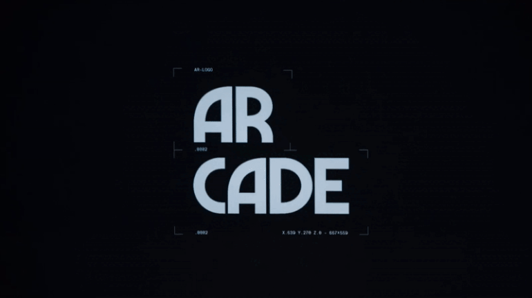
Image: Caserne/Behance
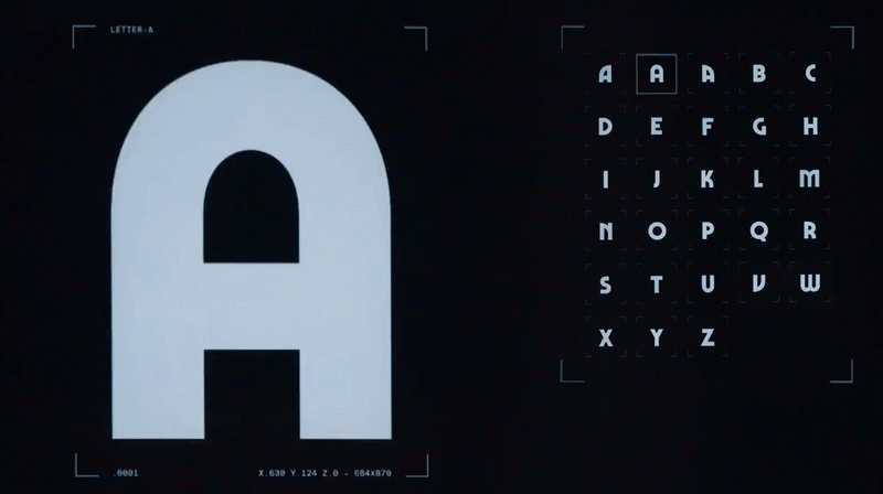
Image: Caserne/Behance
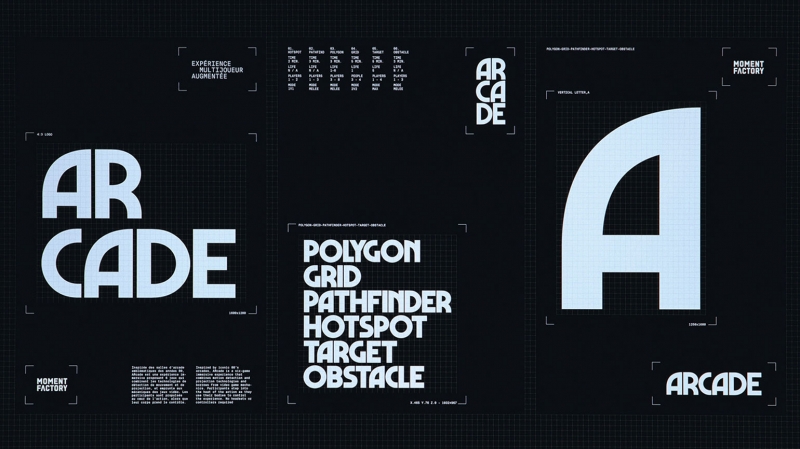
Image: Caserne/Behance
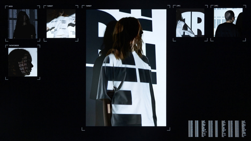
Image: Caserne/Behance
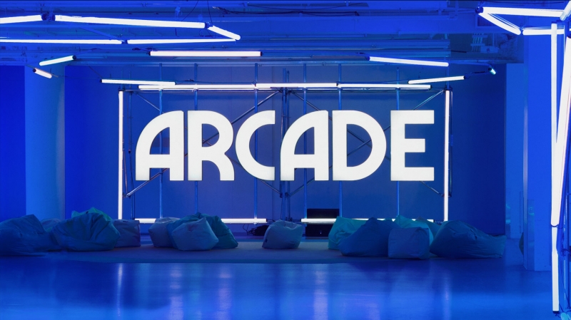
Image: Caserne/Behance
Aleph Farms
Meanwhile, Aleph Farms is redefining meat. The company develops steaks grown from the cells of Lucy, an Angus cow living happily in California.
Aleph asked creative agency BOND to design Aleph Farms’ parent brand and its first product, Aleph Cuts. At the same time, Aleph Farms and Aleph Cuts are two different brands within the same family.
BOND used a straight-line font, minimal color palette, and photographs for Aleph Farms. Aleph Cuts is more associated with the pleasure of eating – a more frivolous and flowing decorative font was chosen for it.
The name Aleph Farms connects us with the roots of civilization, because aleph is the first letter of one of the oldest writing systems. To create the Aleph logo, the designers flipped the first letter of the alphabet to look like a bull’s head. The inverted aleph literally illustrates the “reversal in the concept of steaks.” The “movement” of a brand is shown with a capital letter that moves around its own axis. So the symbol works for the main idea of the company – a revolution in agriculture and food culture.
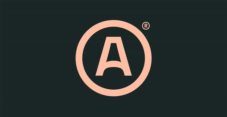
Image: BOND Creative Agency / Behance
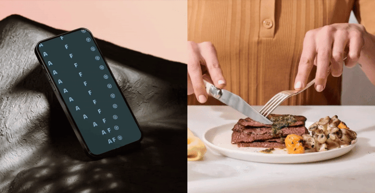
Image: BOND Creative Agency / Behance
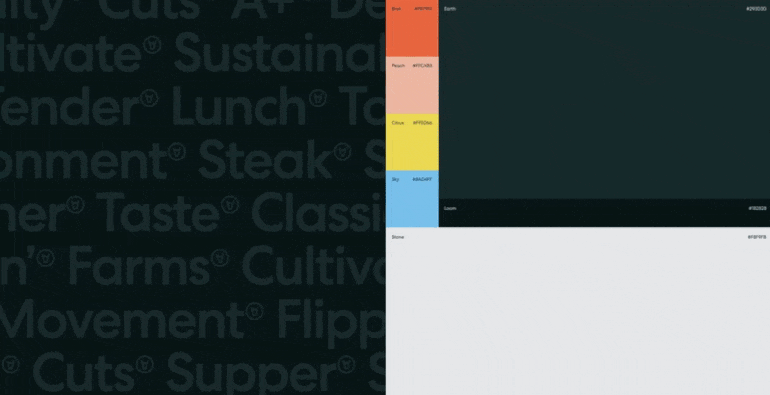
Image: BOND Creative Agency / Behance
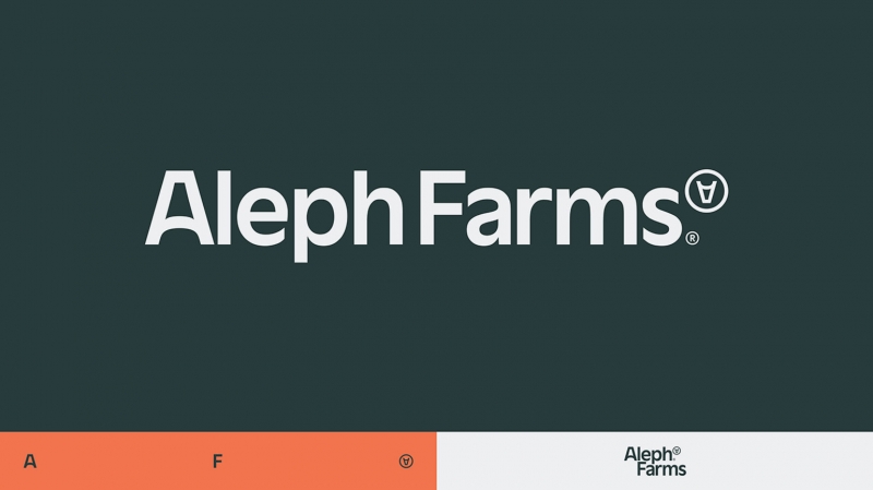
Image: BOND Creative Agency / Behance
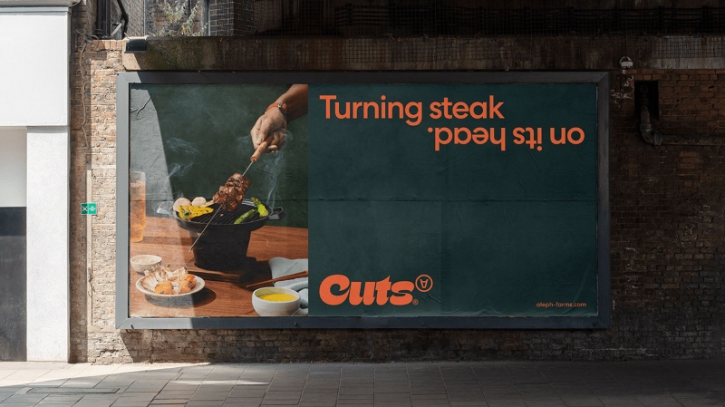
Image: BOND Creative Agency / Behance