Soda 7Up has updated its identity for the first time in seven years
Bright and contrasting colors complete the upward movement
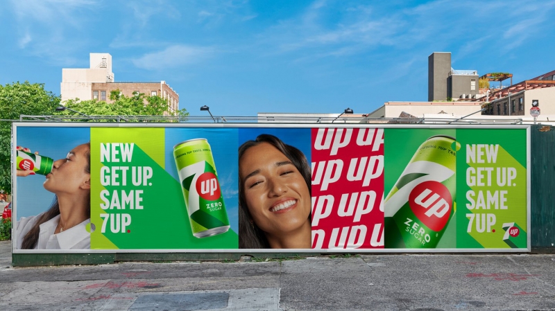
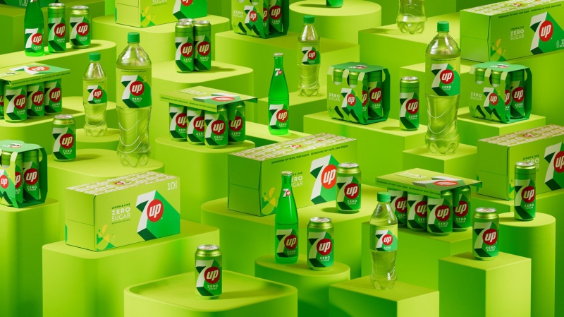
7Up has updated its branding for the first time in over seven years, including positioning and identity. The PepsiCo team did this to “better convey the essence of the brand in the international market.” 7Up and 7Up Zero will be released in new packaging from March 2023.
New 7Up identity
Image: PepsiCo (pepsico.com)
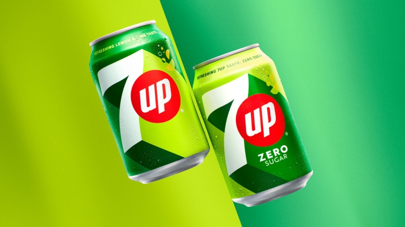
The design has become more minimalistic and simplified. But he, surprisingly, is not boring and even harsh. The famous 7Up lime palette has been retained, although some new citrus tones have been added to it. The logo was made promising: contrasting planes create the feeling that the seven is moving up. This is in line with the new UPliftment slogan (“lifting to the next level”). This means a little relief, a distraction from the ordinary and everyday.
New 7Up identity
Image: PepsiCo (pepsico.com)
The citrus slices and bubbles are made flat so that they look like geometric shapes.
New 7Up identity
Image: PepsiCo (pepsico.com)
It is likely that this is a reaction to Turner Duckworth’s refresh of the Sprite branding. This company is 7Up’s main competitor in the lemon-lime soda market. Soda brands have recently been redesigning, focusing on minimalism and sustainability. But not all of these changes are pleasing to customers: for example, consumers were upset when San Pellegrino decided to abandon foil lids on cans.