6 new rap artist covers for inspiration
Even if you’re not creating covers for musicians, but are doing promotional pages or illustrations, covers can help you develop visualization and make your work more interesting. What tricks should be taken into account – read in our selection with comments.
Creative designer maryco, teacher at I. D. Shadr Art School. Experimenting with music in Telegram.
And to consider the selection for the benefit of work:
- take screenshots of an unusual design for a folder with references;
- save examples of font combinations with a common style;
- note interesting ideas for presenting information with the help of a visual.
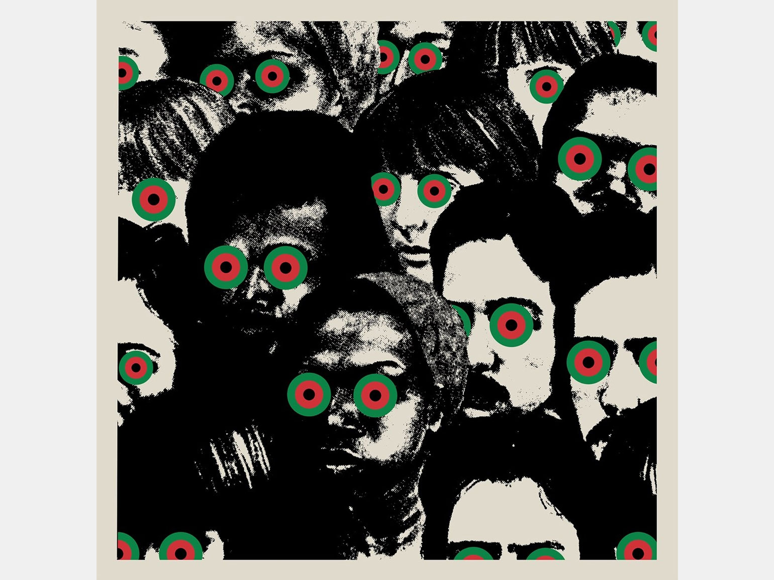
About the cover: The black and white cover with color accents is reminiscent of 1930s Mickey Mouse Club meetings. Before us is a huge impersonal crowd on the verge of a slam, which is about to be stolen by aliens. By the way, in the clip we see a similar picture: the artist descends to Earth on something resembling a truck. He dances and gathers around him a huge crowd that follows him through the streets of New York. And if aliens start to disperse it on the cover, in the video the police do it.
Image: Atlantic Recording Corporation
This cover has a natural division relative to the middle vertical: the overall layout of its elements is symmetrical, but each part has its own accents that make the composition livelier. This helps bring out the purple glow in the center without splitting the image into two equal pieces.
Color minimalism looks very stylish: black and white bulk, pink-purple glow at the top center and a small, barely noticeable spot of blue hair in the crowd on the right.
Although there are many objects in the composition, it does not seem overloaded. People in the crowd merge with each other: they turn into noise (background or pattern) and fill the entire space with themselves.
The entire cover looks like a drawing of a neural network. It is difficult to see the clear figures of people, they are disproportionate and rather crooked, but at the same time intuitively readable. Even if this cover was not drawn by a neural network, then it is high time for designers to try to create something cool with its help. This is a call to myself as well :)
By the way, this cover reminds me of a scene from the new Ant-Man movie, where a lot of ant-men are climbing on top of each other to get a giant glowing ball – look.
Roc Marciano & The Alchemist – The Elephant Man’s Bones
About the cover: The cover of the album echoes its title. The Elephant Man, or Joseph Merrick, is a British man with a huge amount of physical deformities. His tragic fate became the basis of David Lynch’s 1980 film The Elephant Man. According to some rumors, Michael Jackson wanted to buy the skeleton of Joseph Merrick for his personal collection. In the new album, the musicians Roc Marciano & The Alchemist decided to return to discussions about the meaning of being, as well as the value of inner and outer beauty.
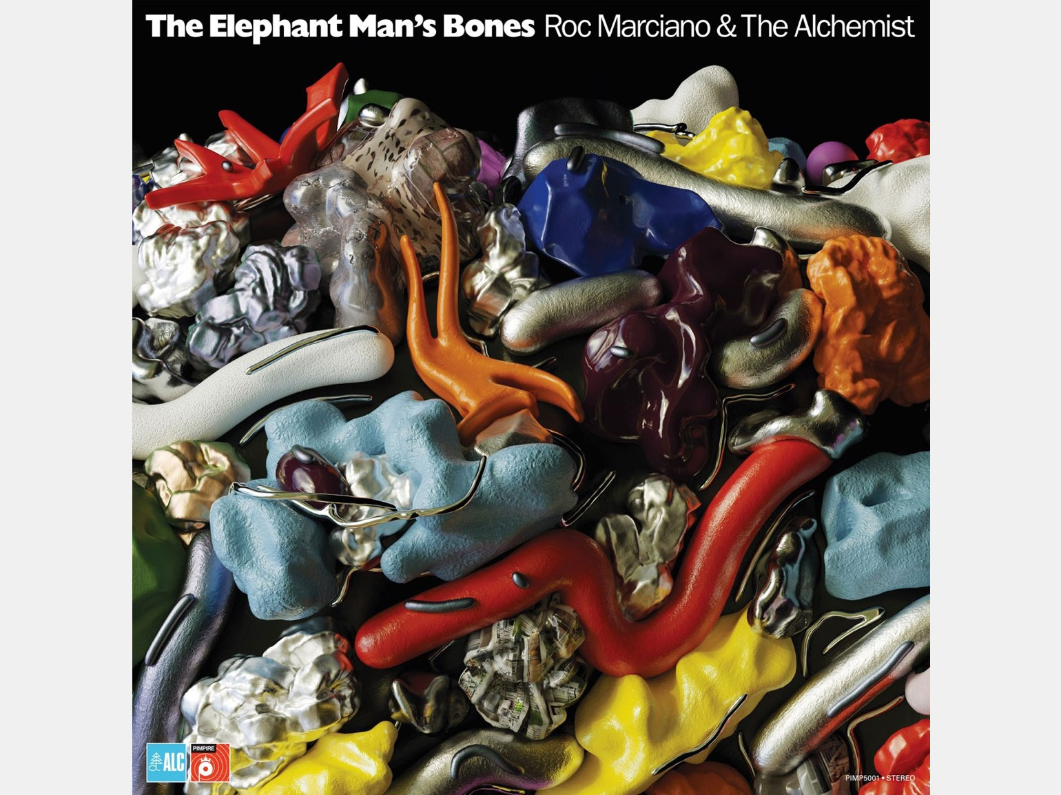
I see simplicity in this cover: it reminds me of the formation of particles and molecules in the quantum world. From the point of view of an ordinary person, this simplicity is barely noticeable or not noticeable at all.
If you do not know what kind of music the cover illustrates, then you might think that there is hard electronics inside, because in the picture there is a visual hodgepodge that looks like compressed garbage. Although in reality the tracks of the album even sound like light jazz.
Objects of different shapes and textures envelop each other and leave no empty space. The cover has an interesting variety of materials: plastic, metal, maybe rubber, stone. They convey a very light and simple sound of the album: here each individual sound is a particle that, when colliding with others, forms its own sound and sets the rhythm.
The work will inspire designers to combine different textures in their own projects. Metal can look like chewing gum, glass can look like the most durable object of the composition. So fantasize and experiment.
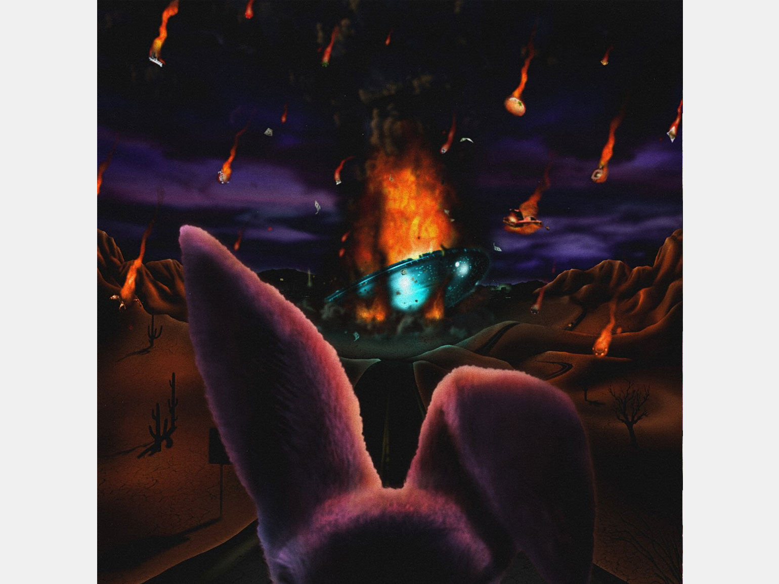
About the cover: the rapper’s new album is a field for experiments and, to some extent, a farewell to the past. The chaotic and colorful cover features a disintegrating, flaming spaceship and a plush hare ready to run away from it. In the album, Freddie talks about a difficult past: emotional abuse, problems with the police, substances.
Image: Warner Records
Due to classical sampling, the album sends the listener back 20 years – to those times when the grass was greener and the music was livelier. There is no electronic stuff here, only juicy drums and beautiful samples from the 1970s-1980s.
The album sounds very nostalgic and the cover helps to put you in that mood. The artists on the album are the same rappers who respect hip-hop classics and can sound perfect on trap beats (like A$AP Rocky, Joey Bada$$ and Run The Jewels) and classic sample beats.
The sound of the album is perfectly illustrated by its cover. In its style, it is similar to the works of the late 20th century: if you put it next to the albums from the 1970s, then it will not stand out much stylistically.
The cover is very interesting from a technical point of view. Here is a collage of different photos with filters, including overprint (printing effect like old newspapers). This cover also reminded me of linocut. Note to designers: traditional techniques can be very cool to combine with digital tools. This cover is a great example.