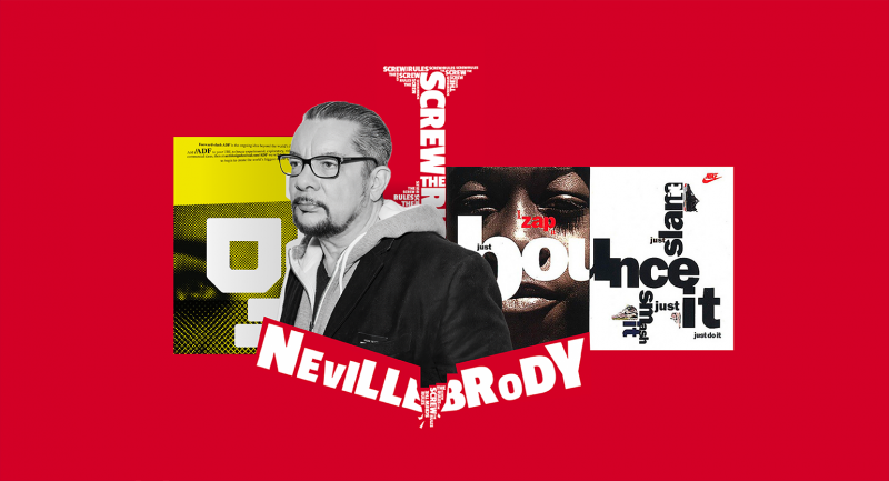
Iconic covers, corporate identity and signature fonts from a British graphic designer.
Neville Brody was born on April 23, 1957 in London. He was educated as a designer at the London College of Printing and his career began to flourish in the 1980s. Britain was swept by a wave of punk rock in its various manifestations, and this style – expressive, daring, energetic – was reflected in Brody’s works. From 1980-1982, he created music album covers for Fetish Records.
Brody, who saw the dawn of graphic design and layout software, experimented with formats, combining manual techniques and new technologies. He created bright illustrations and combined them with unusual fonts, making text an important part of the visual composition. With the advent of graphics programs, Brody plunged into digital design: web, fonts, layout.
In 1987, the designer opened his own Brody Studio, working with big brands like Nike. In 1994, he founded the Research Studio agency (in 2014, the company rebranded to become Brody Associates). In 1988, the Briton published The Graphic Language of Neville Brody, where he spoke about his design method. In 1990, together with Erik Spiekermann, he created the FontFont font library.
Brody’s main areas of work are graphic design, corporate identity and typography. Let’s talk about several major projects of this British designer.
The Face 1981–1986
Brody worked as an art director for the pop culture magazine The Face. There, the designer often violated the classic layout rules: headlines of articles could be typed in huge or, conversely, too small type, crashing into images. Uneven multi-level letters, bright illustrations and visual symbols – all this gave the publication a driving mood of the youth of the 1980s.
Nike 1988
In 1988, Brody first worked on an advertising campaign for a major brand – Nike. And it was again based on typography.
The Nike team offered Brody slogan phrases that are meaningful to the company, and the designer played with them visually, experimenting with fonts and combining them with images. Brody’s illustrations were first used on T-shirts and promotional materials for the brand’s young audience. But after the success of the advertising campaign, Neville was asked to design clothing, baseball caps, towels and other Nike products.
wallpaper 2009
In 2009, Neville Brody was invited to illustrate the cover of Wallpaper magazine. The project was exclusive because the edition with the author’s cover was not released for general sale, but only for subscribers who receive the edition by mail.
Brody created a design that works on several levels of perception at once. At first glance, the cover is simple – a small rebus illustration is printed on white matte cardboard. The name Wallpaper is applied with transparent varnish and becomes noticeable only when tilted – the designer did not create unnecessary visual noise, because subscribers probably know which edition they received.
Channel 4 2015
For the British television company, Neville Brody created two fonts at once – Horseferry and Chadwick. They are named after two streets that pass near the London headquarters of the company.
Horseferry is designed for headlines – it is bright, with unusual details: the semi-oval is cut off, the main stroke k is supplemented with a short stroke on top, and n, B, E, on the contrary, are beveled. The edgy Horseferry reflects Channel 4’s fast-paced, progressive and complex personality.
In contrast to this, the company’s informational texts are typed in clean, functional, legible Chadwick. The characters of this font are rounded geometric, without unexpected solutions – this, in turn, symbolizes the rational, reliable nature of the company.
TCCC Unity
2018
Thanks to Neville Brody, the Coca-Cola Company for the first time in its history has its own font – TCCC Unity. It is an acronym for The Coca-Cola Company Unity.
The font is based on rounded shapes, the middle horizontal strokes at E and F are shortened, the intra-letter gap at a is stylized as a drop. Brody designed the typeface in multiple weights, so TCCC Unity can be used for a variety of tasks both in print and on the web.
Image: Neville Brody / The Coca-Cola Company

