Shakespeare’s Globe Theater unveils typeface inspired by Renaissance engravings
The first folio of Shakespeare is the first collected works of the poet and playwright, published 7 years after his death. It was published in 1623 under the title: Mr. William Shakespeare’s Comedies, Chronicles, and Tragedies.
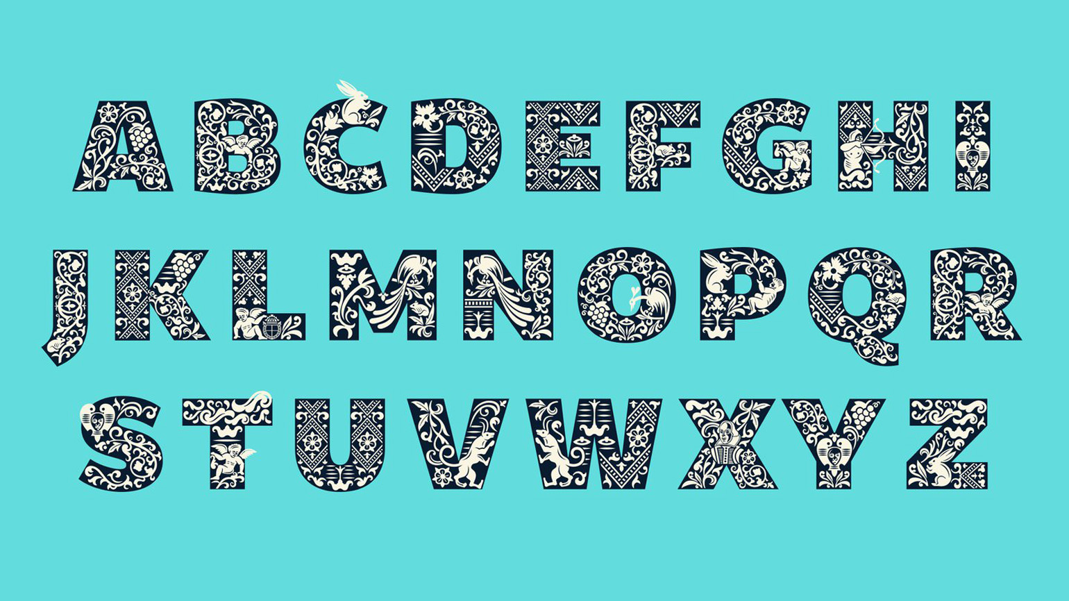
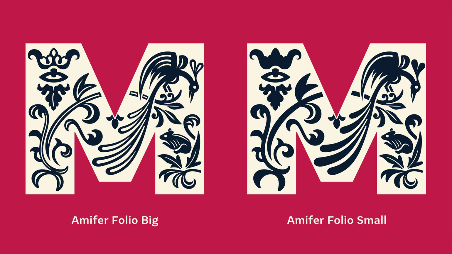
Printed from accurate and authentic texts. In honor of the book’s 400th anniversary, Shakespeare’s Globe Theater collaborated with Typeland to develop a typeface based on woodcuts made from it.
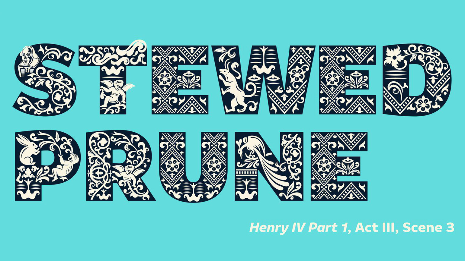
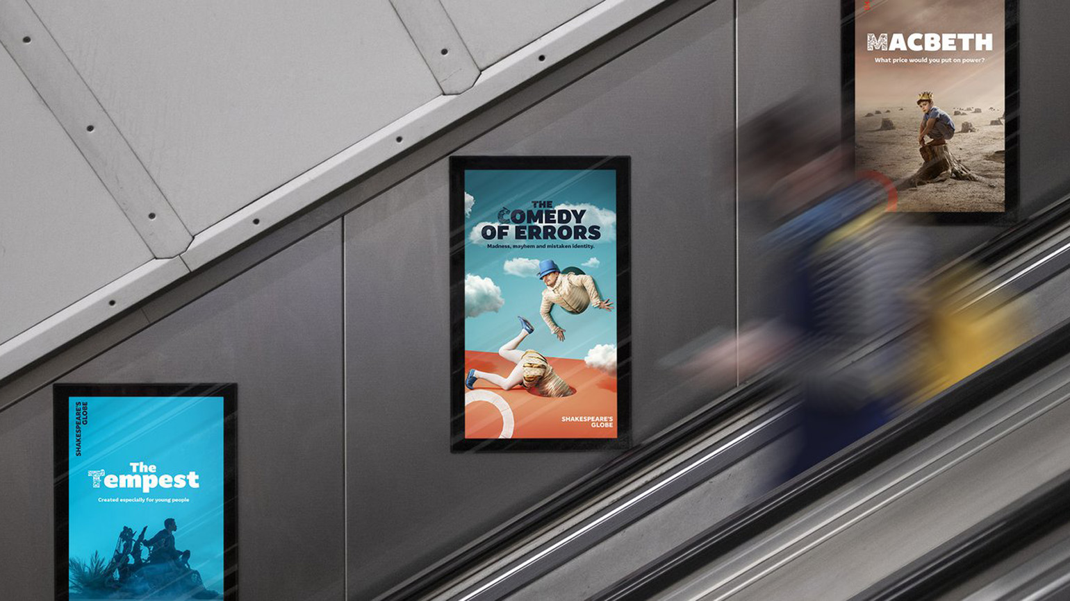
The London-based type design studio has already worked with Globe, as the institution has used the typeface Amifer in previous theatrical seasons. According to Typeland co-founder Alessia Mazzarella, The Globe art director Irene Omodeo Zorini approached Typeland with the idea of “adding illustrated drop caps” to Amifer for the summer 2023 campaign.
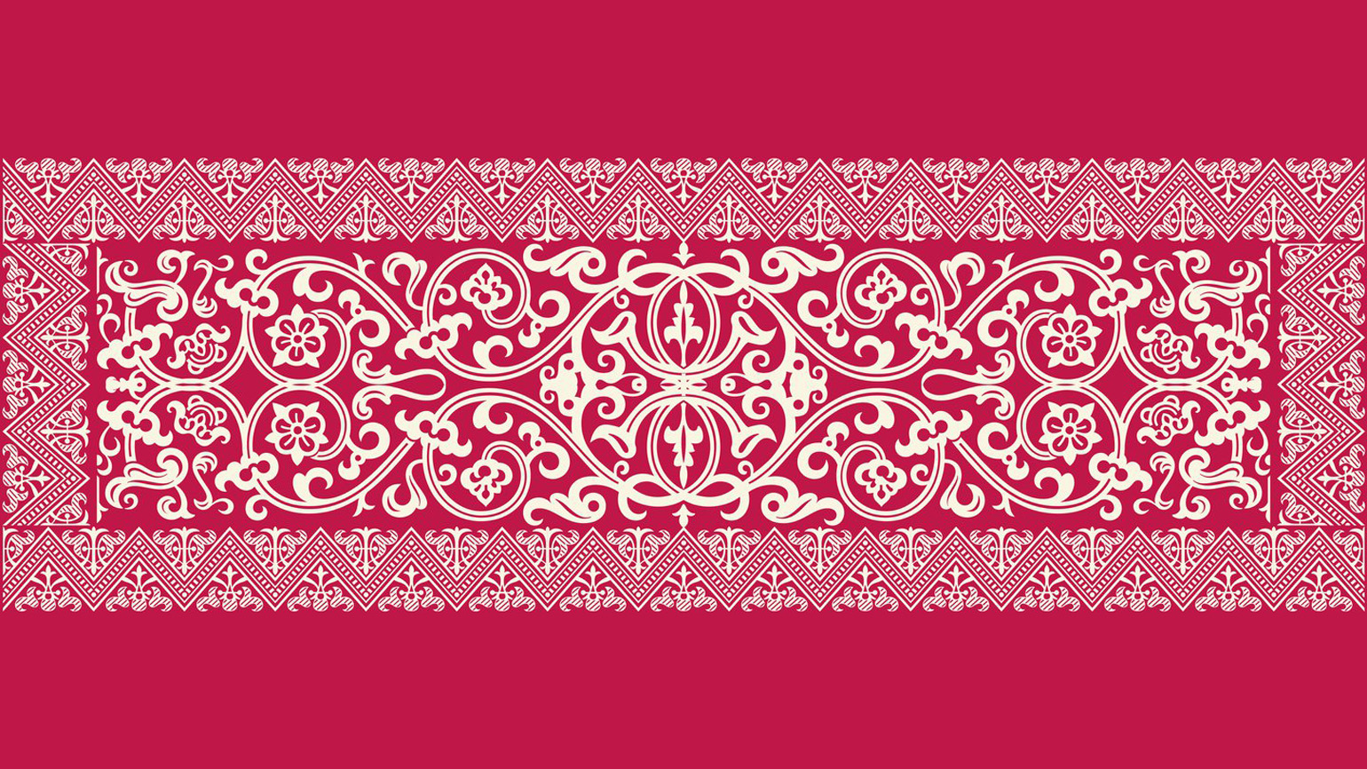
Ornamented letters are a common technique in medieval and renaissance typography to separate chapters and paragraphs. Typeland was supposed to interpret the letters from the folio, modernizing them and tying them to the theme of nature, which will be the centerpiece of the new theater season. The woodcuts serve as the perfect reminder of the fragility and beauty of the natural world, not only visually, but also because of their rarity, as they exist in fewer than 200 remaining folios,” the press release explains.
Typeland co-founder Vaibhav Singh says the biggest challenge was developing illustrative details that could work well at different scales. Experimenting with the level of complexity of the drop cap, Typeland came up with the idea of creating two different fonts – Amifer Folio Big and Amifer Folio Small – that can be used in combination to control the level of detail desired.
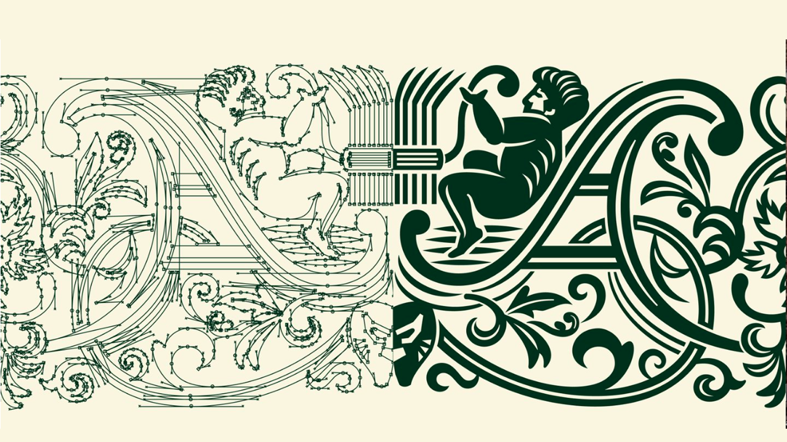
Another challenge was the digitization of the woodcuts. “Woodcuts were printed with the expectation that they could only be worked on at a certain scale, and drawing them so that their form works in digital font using different dot sizes can be tricky,” says Singh.
Each version of the font features a “special set of characters,” ranging from angelic and demonic creatures to gargoyles taken from the First Folio woodcuts. The posters will use bright colors, just like two years before.

