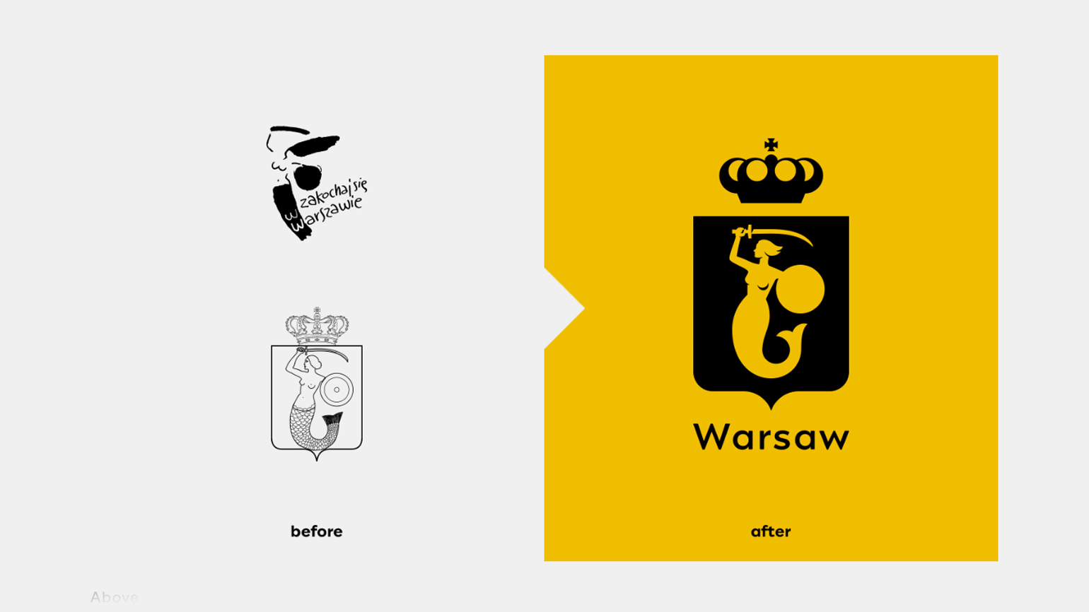
Designers have created a new logo for Warsaw
Age-old traditions, the profile of a great woman and historical accuracy
Warsaw-based studio Podpunkt has unveiled a new logo and design system for the Polish capital. The renovation was initiated by the city hall. The designers have retained the historical symbol of the mermaid and the traditional colors of yellow and red.
Previously, the city used two symbols – a traditional coat of arms and an advertising logo. Their styles were completely different. The studio says none of the previous two images met the requirements for digital responsiveness, scaling, or legibility. And each of the 18 districts of Warsaw had its own logo, and they were not connected in any way.
As a result, workshops were held with officials, as well as with 48 institutions, at which they realized that the city lacks a unified style, which is why it is not always clear what information comes from the city hall. The updated logo was presented in four colors. A palette of 29 colors was added to it. It is based on a modular grid and geometric shapes.
We made three round icons for mobile applications. Designer Mateusz Mahalski has created a custom version of his Engram typeface for the lettering, adjusting it for better readability when scaled.
During the work, the designers consulted Anna Sviatlovskaya, a historian from the Museum of Warsaw, to choose the shape of the sword held by the mermaid. And her profile repeats the features of Marie Skłodowska-Curie. “We wanted to honor the memory of an inspiring woman from Warsaw, and Maria immediately came to mind. We love that the mermaid has the features of a woman known the world over for her passions and interests (not just her pretty face).”

